Hands-on data exploration using R
Sebastian Sauer

last update: 2018-11-21
Setup
Overview
Setup
Tidyverse 101
Data diagrams 101
Case study
whoami
system("whoami")R enthusiast
Data analyst/scientist
Professor at FOM Hochschule
Upfront preparation
Please install the following software upfront:
Starting RStudio will start R automatically.
Please also make sure:
- Your OS is up to date
- You have internet access during the course
- You reach the next power socket (maybe better bring a power cable)
You, after this workshop

Well, kinda off...
Learning goals
Understanding basic tidyverse goals
Applying tidyverse tools
Visualizing data
Basic modeling
Intended audience
Analysts who have used R somewhat, but who are new to the tidyverse
Applied workers in the field of data analyses who want to learn modern techniques
A basic working knowledge of R is needed to thoroughly follow the workshop
- You should know how to get R and Rstudio running (and packages installed)
- You should know some basics of R (such as object definition and indexing, using functions)
- You should have some experience with coding (not strictly necessary, but helpful)
We'll use the following R packages
pckgs <- c("nycflights13", "mosaic", "broom", "corrr", "lubridate", "viridis", "GGally", "ggmap", "pacman", "sjmisc", "leaflet", "knitr", "tidyverse", "tidyimpute", "na.tools", "checkpoint")Please install each missing package prior to the workshop from within R:
install.packages("nycflights13")Load each package after each start of Rstudio
library(pacman)p_load(pckgs, character.only = TRUE)Tip: Use search() to see loaded packages and installed.packages() for installed packages.
Simpler: Check the "packages pane" in RStudio.
Data we'll use: mtcars
mtcarsis a toy dataset built into R (no need for installing).Data come from 1974 motor sports magazine describing some automotive.
Columns: e.g., horsepower, weight, fuel consumption
Load the dataset:
data(mtcars)Get help:
?mtcarsData we'll use: flights
flightsis a dataset from R packagenycflights13(package must be installed).Data come from flights leaving the NYC airports in 2013.
Columns: e.g.., delay, air time, carrier name
Load the dataset:
data(flights, package = "nycflights13")Get help:
?flights
Load the data each time you open RStudio (during this workshop).
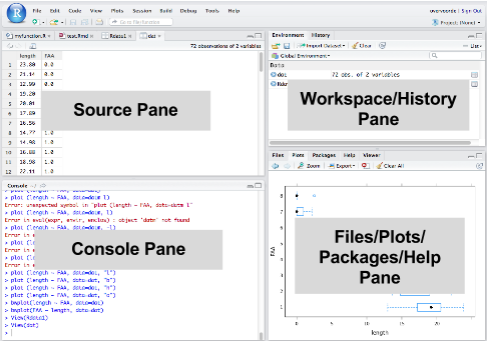
RStudio running
The tidyverse
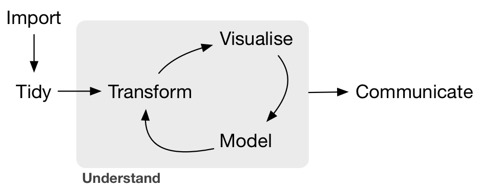
The data analysis (science) pipeline
Get the power of the uni tidyverse

But I love the old way ...

Nice data

Dataset mtcars
glimpse(mtcars)#> Observations: 32#> Variables: 11#> $ mpg <dbl> 21.0, 21.0, 22.8, 21.4, 18.7, 18.1, 14.3, 24.4, 22.8, 19....#> $ cyl <dbl> 6, 6, 4, 6, 8, 6, 8, 4, 4, 6, 6, 8, 8, 8, 8, 8, 8, 4, 4, ...#> $ disp <dbl> 160.0, 160.0, 108.0, 258.0, 360.0, 225.0, 360.0, 146.7, 1...#> $ hp <dbl> 110, 110, 93, 110, 175, 105, 245, 62, 95, 123, 123, 180, ...#> $ drat <dbl> 3.90, 3.90, 3.85, 3.08, 3.15, 2.76, 3.21, 3.69, 3.92, 3.9...#> $ wt <dbl> 2.620, 2.875, 2.320, 3.215, 3.440, 3.460, 3.570, 3.190, 3...#> $ qsec <dbl> 16.46, 17.02, 18.61, 19.44, 17.02, 20.22, 15.84, 20.00, 2...#> $ vs <dbl> 0, 0, 1, 1, 0, 1, 0, 1, 1, 1, 1, 0, 0, 0, 0, 0, 0, 1, 1, ...#> $ am <dbl> 1, 1, 1, 0, 0, 0, 0, 0, 0, 0, 0, 0, 0, 0, 0, 0, 0, 1, 1, ...#> $ gear <dbl> 4, 4, 4, 3, 3, 3, 3, 4, 4, 4, 4, 3, 3, 3, 3, 3, 3, 4, 4, ...#> $ carb <dbl> 4, 4, 1, 1, 2, 1, 4, 2, 2, 4, 4, 3, 3, 3, 4, 4, 4, 1, 2, ...Data wrangling
Two tidyverse principles
Knock-down principle

Pipe princriple

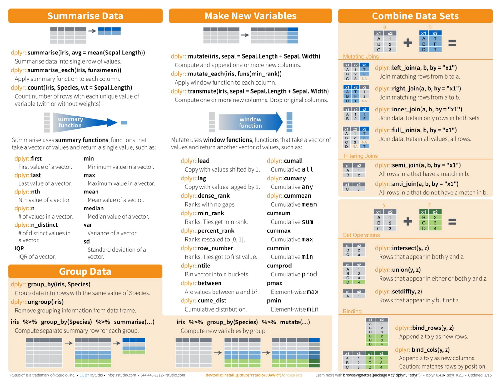
Atoms of the knock-down principle
filter()select()mutate()group_by()- ...
Filtering rows with filter()
Extract rows that meet logical criteria.
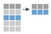
Filter table mtcars such that only rows remain where cols equal 6
filter(mtcars, cyl == 6)#> mpg cyl disp hp drat wt qsec vs am gear carb#> 1 21.0 6 160.0 110 3.90 2.620 16.46 0 1 4 4#> 2 21.0 6 160.0 110 3.90 2.875 17.02 0 1 4 4#> 3 21.4 6 258.0 110 3.08 3.215 19.44 1 0 3 1#> 4 18.1 6 225.0 105 2.76 3.460 20.22 1 0 3 1#> 5 19.2 6 167.6 123 3.92 3.440 18.30 1 0 4 4#> 6 17.8 6 167.6 123 3.92 3.440 18.90 1 0 4 4#> 7 19.7 6 145.0 175 3.62 2.770 15.50 0 1 5 6filter() - exercises
Filter the automatic cars.
Filter the automatic cars with more than 4 cylinders.
Filter cars with either low consumption or the the super. thirsty ones
filter() - solutions to exercises
data(mtcars) # only if dataset is not yet loadedfilter(mtcars, am == 1)filter(mtcars, cyl > 4)filter(mtcars, mpg > 30 | mpg < 12)Select columns with select()
Extract columns by name.

Select the columns cyl and hp. Discard the rest.
select(mtcars, cyl, hp)#> cyl hp#> Mazda RX4 6 110#> Mazda RX4 Wag 6 110#> Datsun 710 4 93#> Hornet 4 Drive 6 110#> Hornet Sportabout 8 175#> Valiant 6 105select() - exercises
Select the first three columns.
Select the first and third column.
Select all columns containing the letter "c".
select() - solutions to exercises
select(mtcars, 1:3)select(mtcars, 1, disp)select(mtcars, contains("c")) # regex supportedAdd or change a column with mutate
Apply vectorized functions to columns to create new columns.

Define weight in kg for each car.
mtcars <- mutate(mtcars, weight_kg = wt * 2)head(select(mtcars, wt, weight_kg))#> wt weight_kg#> 1 2.620 5.24#> 2 2.875 5.75#> 3 2.320 4.64#> 4 3.215 6.43#> 5 3.440 6.88#> 6 3.460 6.92mutate() - exercises
Compute a variable for consumption (gallons per 100 miles).
Compute two variables in one mutate-call.
mutate() - solutions to exercises
mtcars <- mutate(mtcars, consumption = (1/mpg) * 100 * 3.8 / 1.6)mtcars <- mutate(mtcars, consumption_g_per_m = (1/mpg), consumption_l_per_100_k = consumption_g_per_m * 3.8 / 1.6 * 100)Summarise a column with summarise()
Apply function to summarise column to single value.

Summarise the values to their mean.
summarise(mtcars, mean_hp = mean(hp))#> mean_hp#> 1 146.6875summarise() - exercises
Compute the median of consumption.
Compute multiple statistics at once.
summarise() - solution to exercises
summarise(mtcars, median(consumption))#> median(consumption)#> 1 12.36979summarise(mtcars, consumption_md = median(consumption), consumption_avg = mean(consumption) )#> consumption_md consumption_avg#> 1 12.36979 12.87897Group with group_by()
Create "grouped" copy of table. dplyr functions will manipulate each group separately and then combine the results.
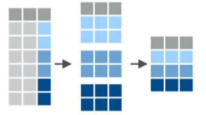
Group cars by am (automatic vs. manual). Then summarise to mean in each group.
mtcars_grouped <- group_by(mtcars, am)summarise(mtcars_grouped, mean_hp = mean(hp))#> # A tibble: 2 x 2#> am mean_hp#> <dbl> <dbl>#> 1 0 160.#> 2 1 127.group_by() - exercises
Compute the median consumption, grouped by cylinder.
Compute the median consumption, grouped by cylinder and am.
group_by() - solution to exercises
mtcars_grouped <- group_by(mtcars, cyl)summarise(mtcars_grouped, mean_hp = mean(consumption))#> # A tibble: 3 x 2#> cyl mean_hp#> <dbl> <dbl>#> 1 4 9.14#> 2 6 12.1 #> 3 8 16.2mtcars_grouped <- group_by(mtcars, cyl,am)mtcars_summarized <- summarise(mtcars_grouped, mean_hp = mean(consumption), sd_hp = sd(consumption))Enter the pipe
Life without the pipe operator
summarise( raise_to_power( compute_differences(data, mean), 2 ), mean)Life with the pipe operator
data %>% compute_differences(mean) %>% raise_to_power(2) %>% summarise(mean)Life with the pipe operator II
Advanced.
data <- mtcars$hpdata %>% `-`(mean(data)) %>% `^`(2) %>% mean()#> [1] 4553.965var(mtcars$hp) * (length(data)-1) / length(data)#> [1] 4553.965Data diagrams
Why we need diagrams
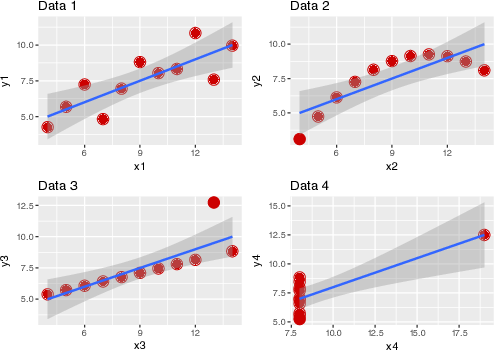
Anatomy of a diagram
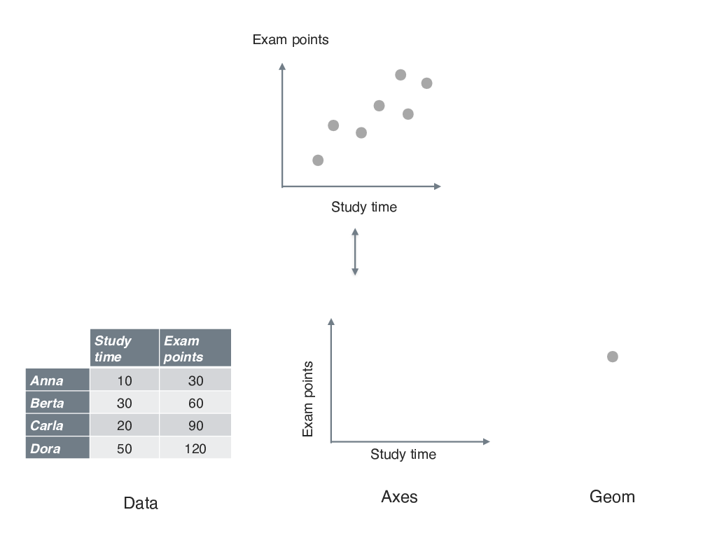
First plot with ggplot
mtcars %>% ggplot() + # initialize plot aes(x = hp, y = mpg) + # define axes etc. geom_point() + # graw points geom_smooth() # draw smoothing line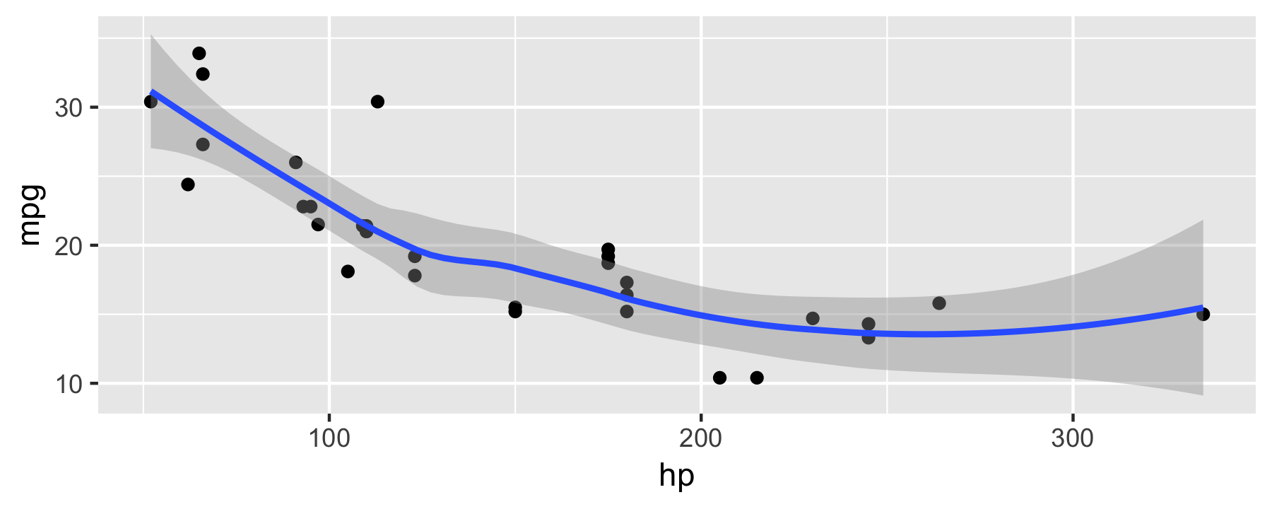
Notice the + in contrast to the pipe %>%.
Groups and colors
mtcars %>% ggplot(aes(x = hp, y = mpg, color = am)) + geom_point() + geom_smooth() + scale_color_viridis_c() + # package "viridis" needed theme_bw()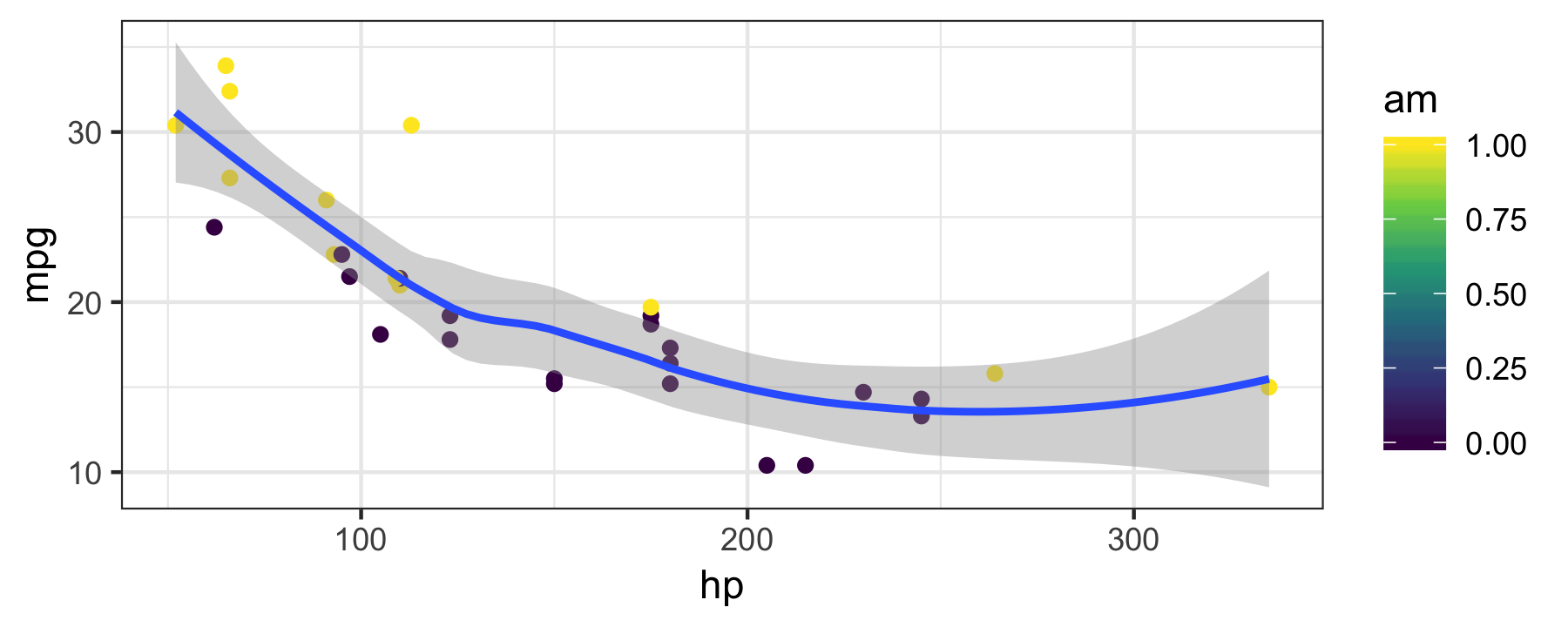
Diagrams - exercises
Plot the mean and the median for each cylinder group (dataset mtcars).
Now add a visualization for the variation in the data.
Diagrams - solutions to exercises 1
mtcars_summarized %>% ggplot() + aes(x = cyl, y = mean_hp, color = factor(am), shape = factor(am)) + geom_point(size = 5)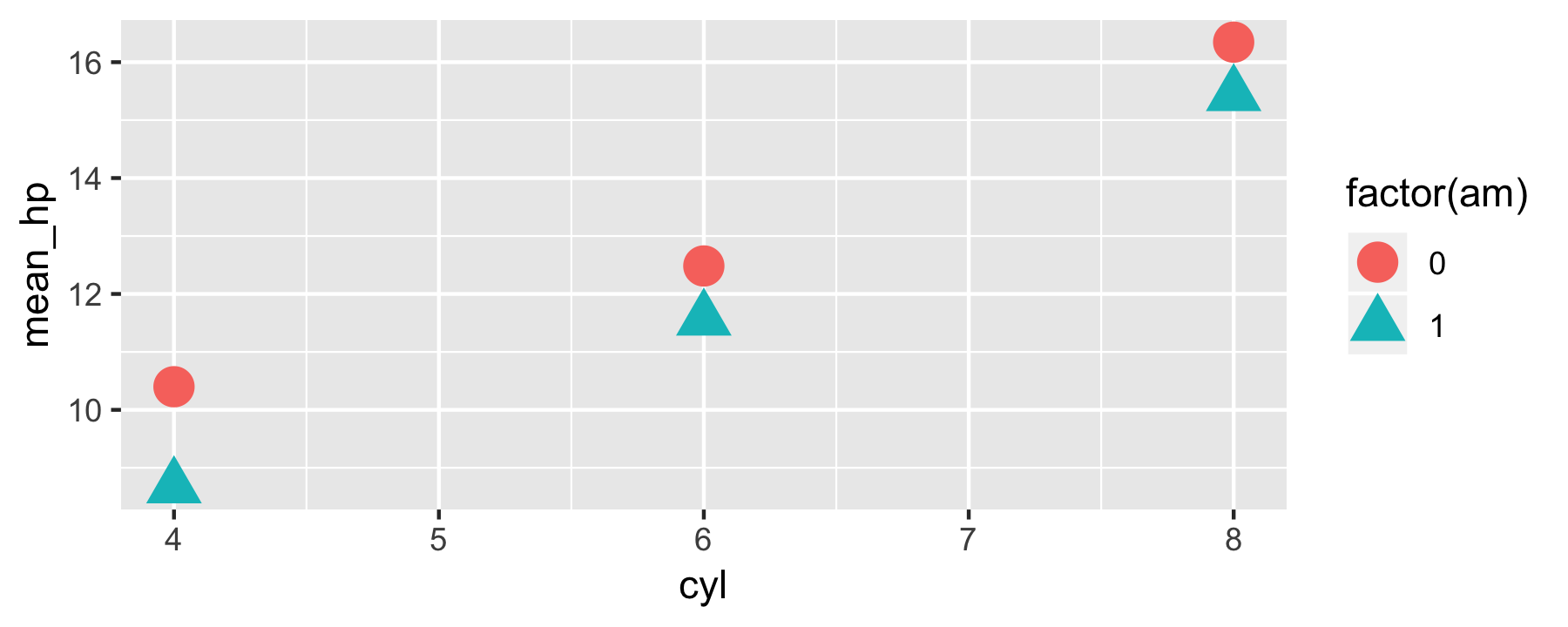
Diagrams - solutions to exercises 2
mtcars_summarized %>% ggplot(aes(x = cyl, color = factor(am), shape = factor(am))) + geom_errorbar(aes(ymin = mean_hp - sd_hp, ymax = mean_hp + sd_hp), width = .2, position = position_dodge(width=0.9)) + geom_point(aes(y = mean_hp), size = 5, position = position_dodge(width=0.9))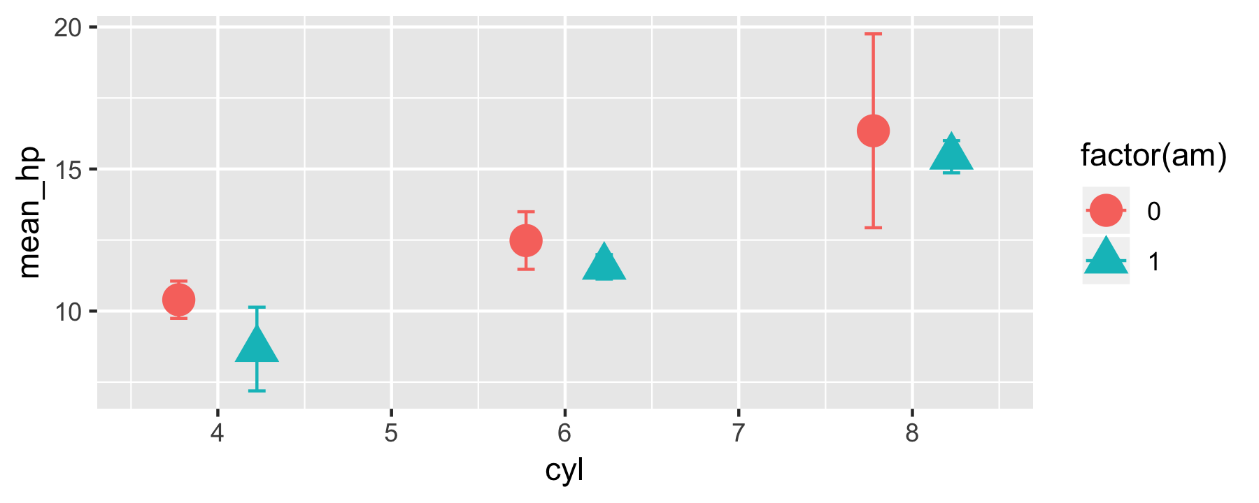
Case study Why are flights delayed?
Know thy data
Don't forget to load it from the package via:
data(flights)A look to the help page:
?flightsGlimpse data
glimpse(flights)#> Observations: 336,776#> Variables: 19#> $ year <int> 2013, 2013, 2013, 2013, 2013, 2013, 2013, 2013,...#> $ month <int> 1, 1, 1, 1, 1, 1, 1, 1, 1, 1, 1, 1, 1, 1, 1, 1,...#> $ day <int> 1, 1, 1, 1, 1, 1, 1, 1, 1, 1, 1, 1, 1, 1, 1, 1,...#> $ dep_time <int> 517, 533, 542, 544, 554, 554, 555, 557, 557, 55...#> $ sched_dep_time <int> 515, 529, 540, 545, 600, 558, 600, 600, 600, 60...#> $ dep_delay <dbl> 2, 4, 2, -1, -6, -4, -5, -3, -3, -2, -2, -2, -2...#> $ arr_time <int> 830, 850, 923, 1004, 812, 740, 913, 709, 838, 7...#> $ sched_arr_time <int> 819, 830, 850, 1022, 837, 728, 854, 723, 846, 7...#> $ arr_delay <dbl> 11, 20, 33, -18, -25, 12, 19, -14, -8, 8, -2, -...#> $ carrier <chr> "UA", "UA", "AA", "B6", "DL", "UA", "B6", "EV",...#> $ flight <int> 1545, 1714, 1141, 725, 461, 1696, 507, 5708, 79...#> $ tailnum <chr> "N14228", "N24211", "N619AA", "N804JB", "N668DN...#> $ origin <chr> "EWR", "LGA", "JFK", "JFK", "LGA", "EWR", "EWR"...#> $ dest <chr> "IAH", "IAH", "MIA", "BQN", "ATL", "ORD", "FLL"...#> $ air_time <dbl> 227, 227, 160, 183, 116, 150, 158, 53, 140, 138...#> $ distance <dbl> 1400, 1416, 1089, 1576, 762, 719, 1065, 229, 94...#> $ hour <dbl> 5, 5, 5, 5, 6, 5, 6, 6, 6, 6, 6, 6, 6, 6, 6, 5,...#> $ minute <dbl> 15, 29, 40, 45, 0, 58, 0, 0, 0, 0, 0, 0, 0, 0, ...#> $ time_hour <dttm> 2013-01-01 05:00:00, 2013-01-01 05:00:00, 2013...Data sanity - quantitative variables
flights %>% descr() #> #> ## Basic descriptive statistics#> #> var type label n NA.prc mean sd se#> year integer year 336776 0.00 2013.00 0.00 0.00#> month integer month 336776 0.00 6.55 3.41 0.01#> day integer day 336776 0.00 15.71 8.77 0.02#> dep_time integer dep_time 328521 2.45 1349.11 488.28 0.85#> sched_dep_time integer sched_dep_time 336776 0.00 1344.25 467.34 0.81#> dep_delay numeric dep_delay 328521 2.45 12.64 40.21 0.07#> arr_time integer arr_time 328063 2.59 1502.05 533.26 0.93#> sched_arr_time integer sched_arr_time 336776 0.00 1536.38 497.46 0.86#> arr_delay numeric arr_delay 327346 2.80 6.90 44.63 0.08#> flight integer flight 336776 0.00 1971.92 1632.47 2.81#> air_time numeric air_time 327346 2.80 150.69 93.69 0.16#> distance numeric distance 336776 0.00 1039.91 733.23 1.26#> hour numeric hour 336776 0.00 13.18 4.66 0.01#> minute numeric minute 336776 0.00 26.23 19.30 0.03#> md trimmed range skew#> 2013 2013.00 0 (2013-2013) NaN#> 7 6.56 11 (1-12) -0.01#> 16 15.70 30 (1-31) 0.01#> 1401 1346.82 2399 (1-2400) -0.02#> 1359 1341.60 2253 (106-2359) -0.01#> -2 3.32 1344 (-43-1301) 4.80#> 1535 1526.42 2399 (1-2400) -0.47#> 1556 1550.67 2358 (1-2359) -0.35#> -5 -1.03 1358 (-86-1272) 3.72#> 1496 1830.51 8499 (1-8500) 0.66#> 129 140.03 675 (20-695) 1.07#> 872 955.27 4966 (17-4983) 1.13#> 13 13.15 22 (1-23) 0.00#> 29 25.64 59 (0-59) 0.09Data sanity - qualitative variables
flights %>% select_if(is.character) %>% inspect()#> #> categorical variables: #> name class levels n missing#> 1 carrier character 16 336776 0#> 2 tailnum character 4043 334264 2512#> 3 origin character 3 336776 0#> 4 dest character 105 336776 0#> distribution#> 1 UA (17.4%), B6 (16.2%), EV (16.1%) ... #> 2 N725MQ (0.2%), N722MQ (0.2%) ... #> 3 EWR (35.9%), JFK (33%), LGA (31.1%) #> 4 ORD (5.1%), ATL (5.1%), LAX (4.8%) ...Distribution - quantitative variables
flights %>% ggplot(aes(x = dep_delay)) + geom_histogram() + scale_x_continuous(limits = c(-10, 60))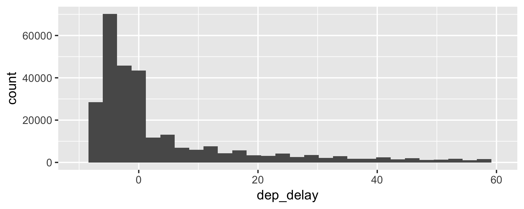
Note the long right tail ("anomaly")
Deal with missing data - omit
flights_nona <- flights %>% drop_na()nrow(flights_nona) / nrow(flights)#> [1] 0.9719992Deal with missing data - replace by some value
flights_nona2 <- flights %>% mutate(dep_delay = ifelse(is.na(dep_delay), mean(dep_delay, na.rm = TRUE), dep_delay))flights_nona2 %>% summarise(sum(is.na(dep_delay)))#> # A tibble: 1 x 1#> `sum(is.na(dep_delay))`#> <int>#> 1 0Deal with missing data - tidy approach
flights_nona3 <- flights %>% impute_all(na.mean)flights_nona3 %>% purrr::map(~sum(is.na(.)))Hint: Use package::function() to disambiguate.
Count missings per row
Advanced.
flights %>% mutate(NA_row = rowSums(is.na(.))) %>% ggplot(aes(x = NA_row)) + geom_histogram()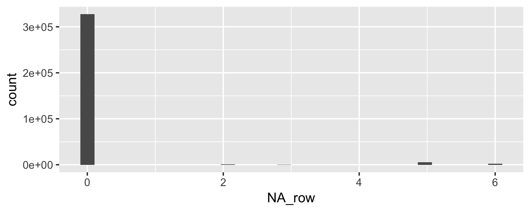
Descriptive statistics for delay
flights %>% drop_na() %>% summarise(mean(dep_delay), median(dep_delay), sd(dep_delay), iqr(dep_delay))#> # A tibble: 1 x 4#> `mean(dep_delay)` `median(dep_delay)` `sd(dep_delay)` `iqr(dep_delay)`#> <dbl> <dbl> <dbl> <dbl>#> 1 12.6 -2 40.1 16Descriptive statistics by origin
flights %>% drop_na() %>% group_by(origin) %>% summarise(mean(dep_delay), median(dep_delay), sd(dep_delay), iqr(dep_delay))#> # A tibble: 3 x 5#> origin `mean(dep_delay… `median(dep_de… `sd(dep_delay)` `iqr(dep_delay)`#> <chr> <dbl> <dbl> <dbl> <dbl>#> 1 EWR 15.0 -1 41.2 19#> 2 JFK 12.0 -1 38.8 15#> 3 LGA 10.3 -3 39.9 13Start modeling
Delay as a function of origin?
delay = f(origin)
More Rish:
dep_delay ~ originLinear models
lm(dep_delay ~ origin, data = drop_na(flights)) %>% tidy()#> # A tibble: 3 x 5#> term estimate std.error statistic p.value#> <chr> <dbl> <dbl> <dbl> <dbl>#> 1 (Intercept) 15.0 0.117 128. 0. #> 2 originJFK -2.99 0.168 -17.7 2.65e- 70#> 3 originLGA -4.72 0.172 -27.5 3.33e-166Some as above, stated differently.
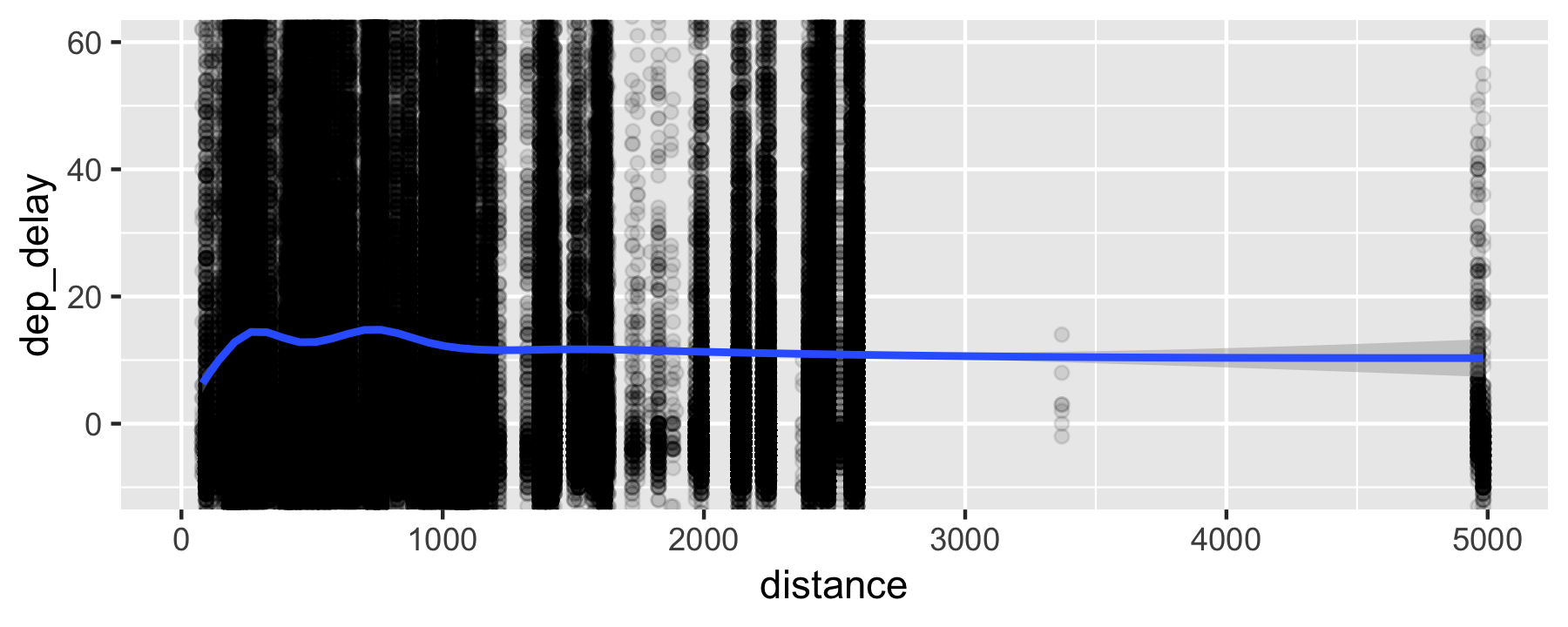
Does distance predicts dep_delay?
flights %>% ggplot(aes (x = distance, y = dep_delay)) + geom_point(alpha = .1) + geom_lm() + coord_cartesian(ylim(-10, 60))Does distance predicts dep_delay?
Alternative visualization (binned data, code)
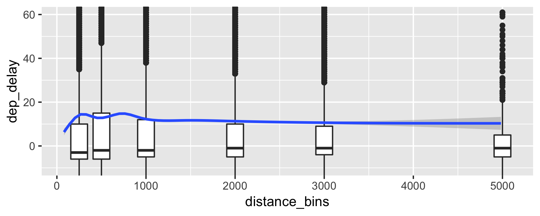
flights %>% mutate(distance_bins = case_when( distance < 250 ~ 250, distance < 500 ~ 500, distance < 1000 ~ 1000, distance < 2000 ~ 2000, distance < 3000 ~ 3000, TRUE ~ 5000 )) %>% ggplot(aes (y = dep_delay)) + geom_boxplot(aes(x = distance_bins, group = distance_bins)) + geom_smooth(aes(x = distance)) + coord_cartesian(ylim = c(-10, 60))Use case_when() for binning and recoding of data values.
Alternative visualization (binned data)
Correlation of distance and delay
flights %>% select(distance, dep_delay, origin) %>% group_by(origin) %>% drop_na() %>% summarise(cor_delay_dist = cor(dep_delay, distance))#> # A tibble: 3 x 2#> origin cor_delay_dist#> <chr> <dbl>#> 1 EWR -0.0361#> 2 JFK -0.0398#> 3 LGA 0.0114Delay as a function of distance
lm(dep_delay ~ I(distance/1000) + origin, data = flights) %>% tidy()#> # A tibble: 4 x 5#> term estimate std.error statistic p.value#> <chr> <dbl> <dbl> <dbl> <dbl>#> 1 (Intercept) 16.8 0.157 107. 0. #> 2 I(distance/1000) -1.60 0.0988 -16.2 9.43e- 59#> 3 originJFK -2.66 0.170 -15.7 3.09e- 55#> 4 originLGA -5.21 0.174 -29.9 3.80e-196Delay per month (code)
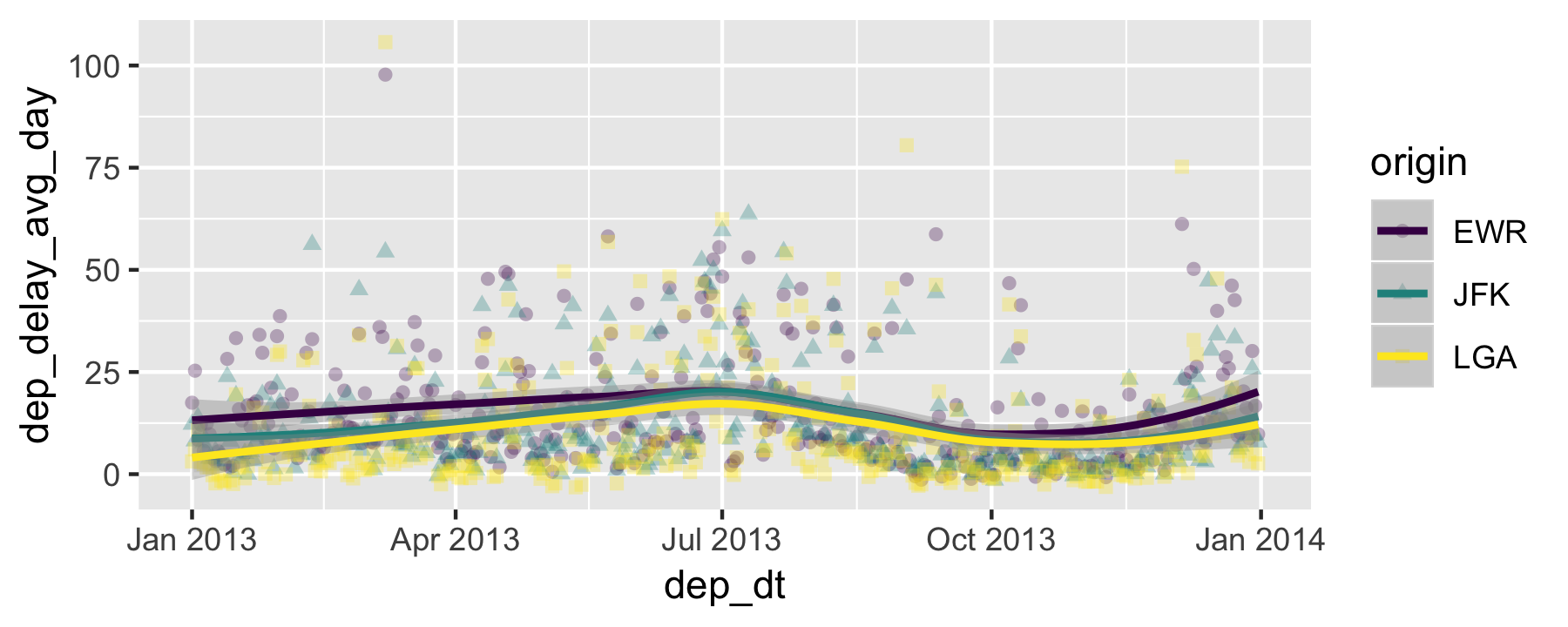
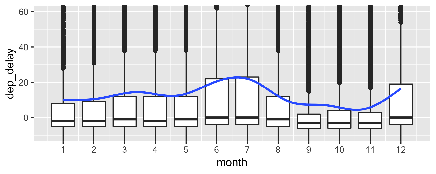
p1 <- flights %>% group_by(origin, month, day) %>% summarise(dep_delay_avg_day = mean(dep_delay, na.rm = TRUE)) %>% ungroup %>% mutate(dep_dt = make_date(2013, month, day)) %>% ggplot(aes(x = dep_dt, y = dep_delay_avg_day, shape = origin, color = origin)) + geom_point(alpha = .3) + geom_smooth() + scale_color_viridis_d()p1Delay per month (output)
Delay per month - boxplot (code)
flights %>% ggplot(aes(x = month, y = dep_delay)) + geom_boxplot(aes(group = month)) + geom_smooth() + coord_cartesian(ylim = c(-10, 60)) + scale_x_continuous(breaks = 1:12)Delay per month - boxplot (output)
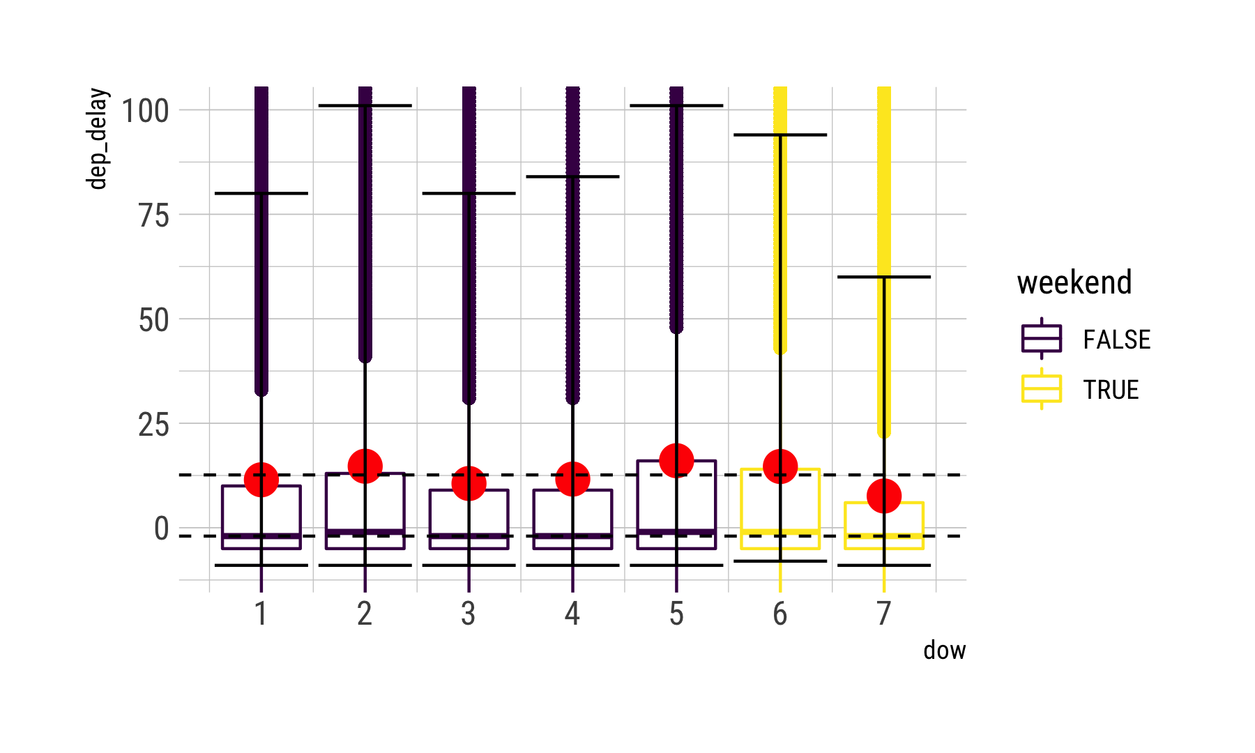
Is it the weekends? (code)
flights <- flights %>% mutate(dow = wday(time_hour), weekend = case_when( dow %in% c(6, 7) ~ TRUE, TRUE ~ FALSE))delay_dow <- flights %>% group_by(dow) %>% drop_na() %>% summarise(delay_m = mean(dep_delay), delay_md = median(dep_delay), q_05 = quantile(x = dep_delay, prob = .05), q_95 = quantile(x = dep_delay, prob = .95))Is it the weekends? (data processed)
delay_dow %>% kable(format='html')| dow | delay_m | delay_md | q_05 | q_95 |
|---|---|---|---|---|
| 1 | 11.477476 | -2 | -9 | 80 |
| 2 | 14.718728 | -1 | -9 | 101 |
| 3 | 10.588355 | -2 | -9 | 80 |
| 4 | 11.643321 | -2 | -9 | 84 |
| 5 | 16.043451 | -1 | -9 | 101 |
| 6 | 14.653974 | -1 | -8 | 94 |
| 7 | 7.594406 | -2 | -9 | 60 |
Is it the weekends? (code)
flights %>% ggplot(aes(x = dow)) + geom_boxplot(aes(group = dow, y = dep_delay, color = weekend)) + geom_point(data = delay_dow, aes(y = delay_m), color = "red", size = 5) + coord_cartesian(ylim = c(-10, 100)) + scale_x_continuous(breaks = 1:7) + geom_hline(yintercept = mean(flights$dep_delay, na.rm = TRUE), linetype = "dashed") + geom_hline(yintercept = median(flights$dep_delay, na.rm = TRUE), linetype = "dashed") + geom_errorbar(aes(ymin = q_05, ymax = q_95), data = delay_dow)Is it the weekends? (output)
Delay per time of the day (code)
Let's check whether delays add up during the day, a popular opinion among travellers.
flights %>% select(dep_delay, hour) %>% ggplot(aes(x = hour, y = dep_delay)) + geom_boxplot(aes(group = hour)) + geom_smooth(method = "lm") + coord_cartesian(ylim = c(-10, 60)) + scale_x_continuous(breaks = 1:24)Delay per time of the day (output)
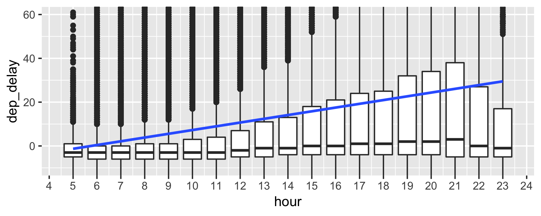
Delay as function of month, hour, origin, and weekday
lm_hour <- lm(dep_delay ~ hour + month + origin + I(dow == 7), data = flights)rsquared(lm_hour)#> [1] 0.04408207Geoplotting
Advanced.
Join airport data
data("airports")flights_airports <- # join destination long/lat flights %>% left_join(airports, by = c("dest" = "faa")) %>% rename(long = lon)origin_latlong <- airports %>% filter(faa %in% c("LGA", "JFK", "EWR")) %>% rename(lat_origin = lat, long_origin = lon)flights_airports <- # join origin long/lat flights_airports %>% left_join(origin_latlong, by = c("origin" = "faa"))Dataframe for plotting (code)
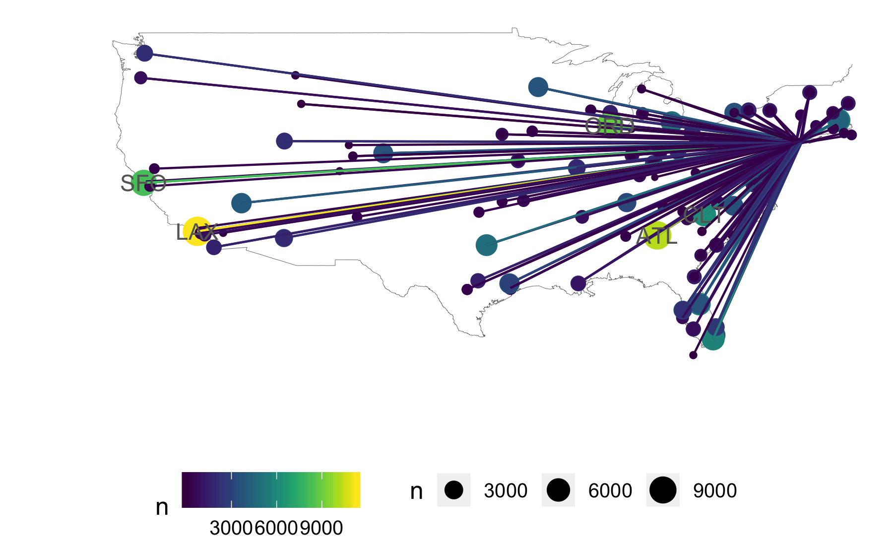
flights_airports_sum <- flights_airports %>% group_by(dest, origin) %>% summarise(n = n(), long = max(long), lat = max(lat), long_origin = max(long_origin), lat_origin = max(lat_origin))Dataframe for plotting (output)
head(flights_airports_sum)#> # A tibble: 6 x 7#> # Groups: dest [5]#> dest origin n long lat long_origin lat_origin#> <chr> <chr> <int> <dbl> <dbl> <dbl> <dbl>#> 1 ABQ JFK 254 -107. 35.0 -73.8 40.6#> 2 ACK JFK 265 -70.1 41.3 -73.8 40.6#> 3 ALB EWR 439 -73.8 42.7 -74.2 40.7#> 4 ANC EWR 8 -150. 61.2 -74.2 40.7#> 5 ATL EWR 5022 -84.4 33.6 -74.2 40.7#> 6 ATL JFK 1930 -84.4 33.6 -73.8 40.6Geo plot flights (code)
ggplot(data = map_data("usa")) + aes(x = long, y = lat, group = group) + geom_path(color = "grey40", size = .1) + geom_point(data = flights_airports_sum, aes(size = n, color = n, group = NULL), alpha = .2) + geom_segment(data = flights_airports_sum, aes(color = n, group = NULL, x = long_origin, y = lat_origin, xend = long, yend = lat), alpha = .5) + geom_text(data = flights_airports_sum %>% filter(n > 6000), aes(x = long, y = lat, label = dest, group = NULL), color = "grey40") + theme_map() + xlim(-130, -70) + ylim(+20, +50) + scale_color_viridis()Geo plot flights (output)
Outlook
Advanced.
Map columns to function with map()
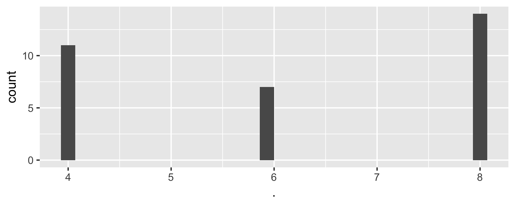
data(mtcars)purrr::map(select(mtcars, 1:2), ~ {ggplot(mtcars, aes(x = .)) + geom_histogram()})#> $mpg#> #> $cyl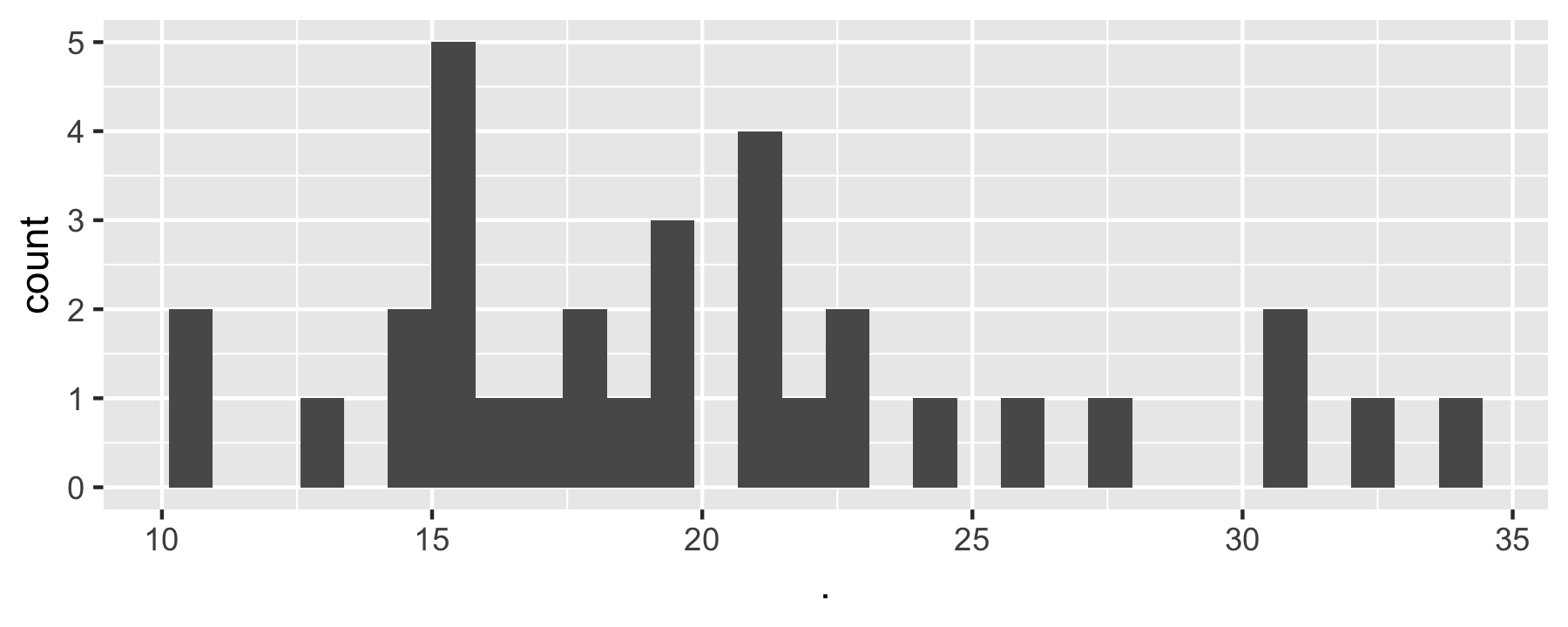
Map TWO columns to function with map2()
flights %>% select_if(~!is.numeric(.)) %>% map2(., names(.), ~ {ggplot(data = flights, aes(x = .x)) + geom_bar() + labs(x = .y, title = .y)})Take flights dataset select all numeric cols map ggplot call to each such that a barplot is plotted where the names of each barplot is an element from the vector of col names.Reshape (transform) dataframe
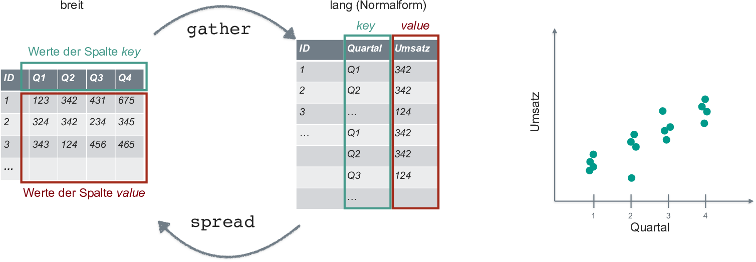
Transform dataframe for plotting
mtcars %>% select_if(is.numeric) %>% gather(key = variable, value = value) %>% ggplot(aes(x = value)) + geom_density() + facet_wrap(~ variable, ncol = 3, scales = "free")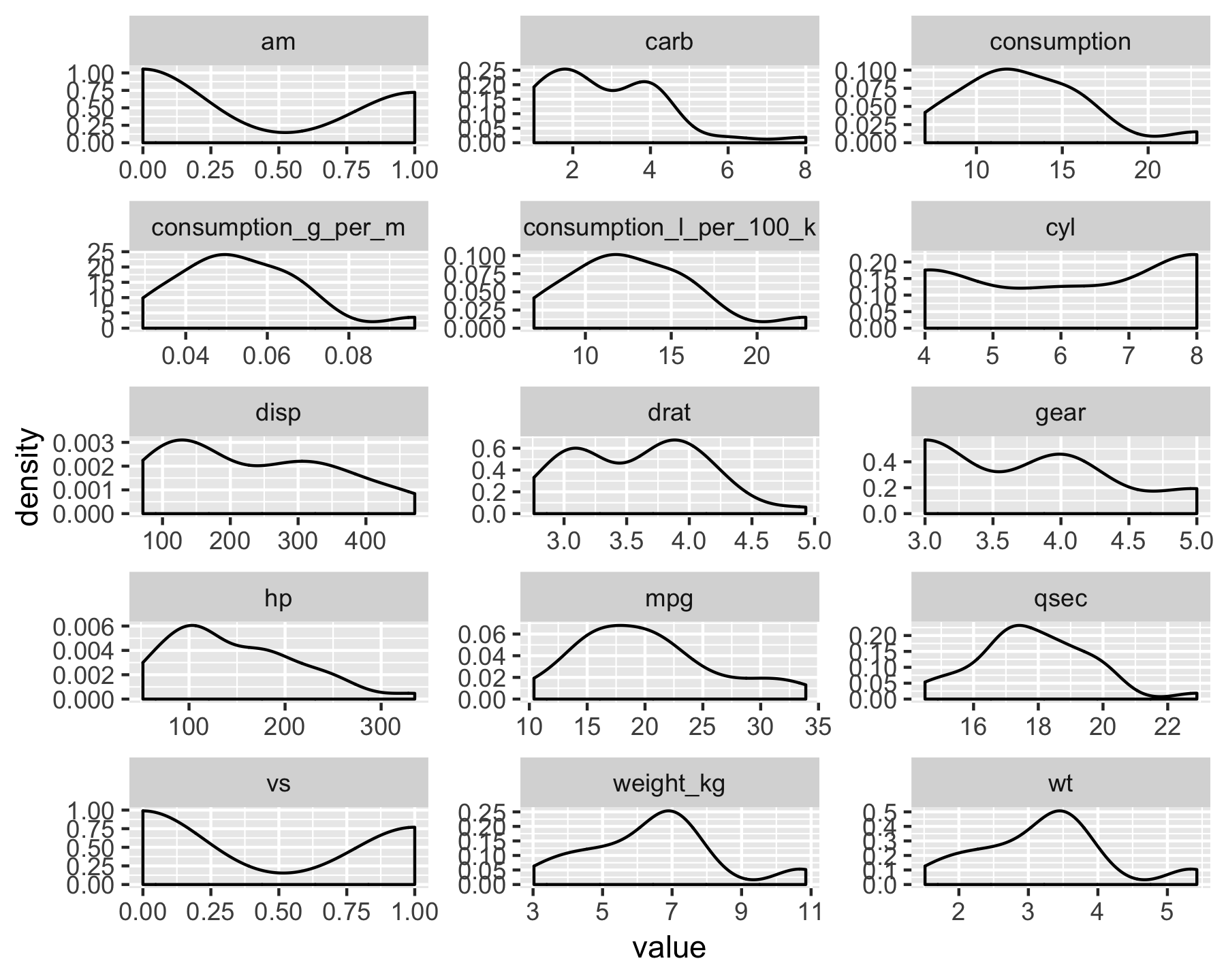
ggplot niceties: Themes
library(hrbrthemes)p2 <- p1 + theme_ipsum() + theme(legend.position = "bottom")p2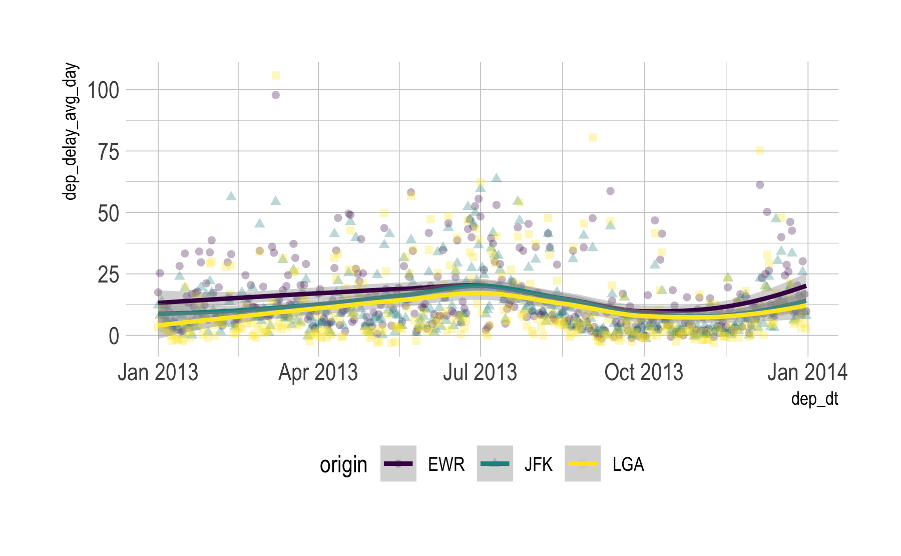
May may need to install fonts upfront; see ?hrbrthemes.
ggplot niceties: Combining plots
library(patchwork)p2 + p2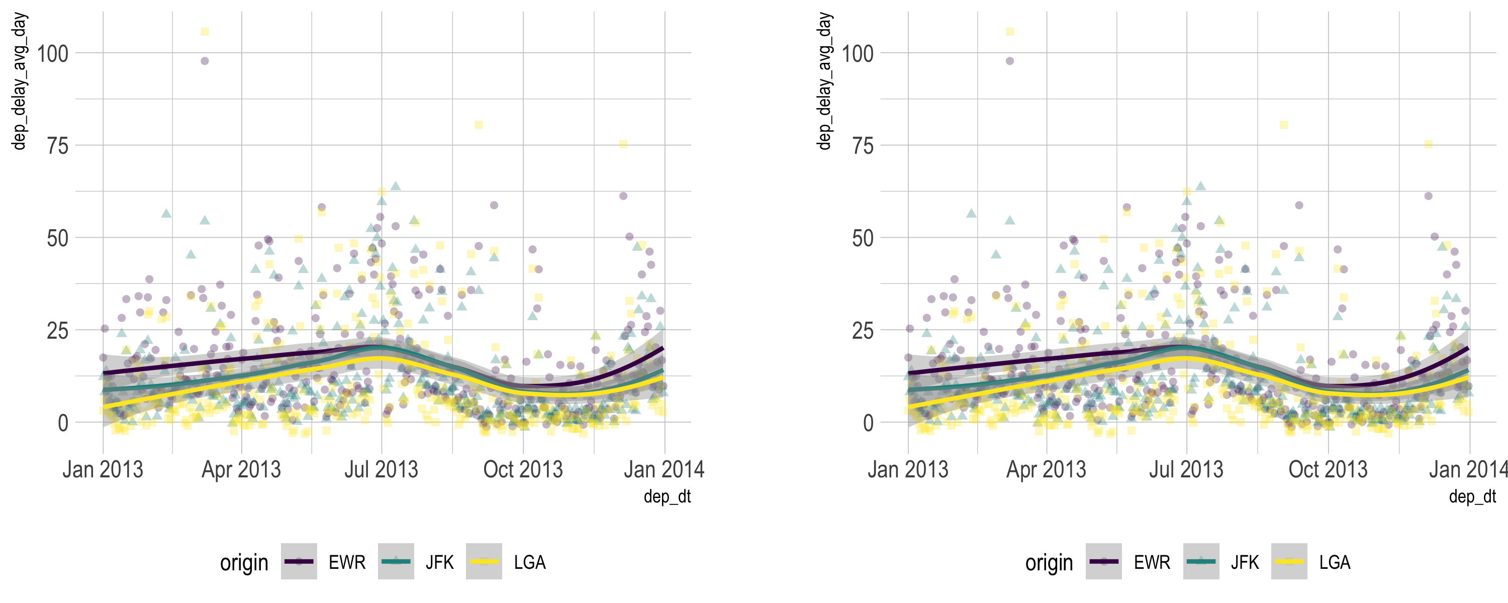
Resources
Wrap-up
That was quick, but it was a start

Credit to
Built using R, RMarkdown, Xaringan. Thanks to the R community and the tidyverse developers. Thanks to Yihui Xie and Antoine Bichat, among others, for Xaringan inspiration. Thanks to FOM Hochschule for supporting me.
Images:
- Data Transformation with dplyr Cheat Sheet, by RStudio
- Modern Dive, Chester Ismay and Albert Y. Kim
- Kermit typping
- RStudio running
- tidyverse
- Process of data analysis
- Yoda
- kid waves
- Nice data
- tidy data
- Magrittr pipe
- Jump car
- Overhead locker
Icons from FontAwesome
SessionInfo
#> [1] "R version 3.5.1 (2018-07-02)"See si.RData for package version (same folder as this presentation).
This document is made reproducible using checkpoint with day set to 2018-09-30.


