Overlaying histograms with a normal curve
Overlaying a histogram (possibly facetted) is not something far fetched when analyzing data. Surprisingly, it appears (to the best of my knowledge) that there’s no comfortable out-of-the-box solution in ggplot2, although it can be of course achieved with some lines of code. Here’s my take.
Setup
library(tidyverse)Some data
d <- read_csv("https://vincentarelbundock.github.io/Rdatasets/csv/openintro/speed_gender_height.csv")## Warning: Missing column names filled in: 'X1' [1]##
## ── Column specification ────────────────────────────────────────────────────────
## cols(
## X1 = col_double(),
## speed = col_double(),
## gender = col_character(),
## height = col_double()
## )glimpse(d)## Rows: 1,325
## Columns: 4
## $ X1 <dbl> 1, 2, 3, 4, 5, 6, 7, 8, 9, 10, 11, 12, 13, 14, 15, 16, 17, 18, …
## $ speed <dbl> 85, 40, 87, 110, 110, 120, 90, 90, 80, 95, 110, 90, 110, 70, 10…
## $ gender <chr> "female", "male", "female", "female", "male", "female", "female…
## $ height <dbl> 69, 71, 64, 60, 70, 61, 65, 65, 61, 69, 63, 72, 70, 68, 63, 78,…d %>%
slice_head(n = 5)## # A tibble: 5 x 4
## X1 speed gender height
## <dbl> <dbl> <chr> <dbl>
## 1 1 85 female 69
## 2 2 40 male 71
## 3 3 87 female 64
## 4 4 110 female 60
## 5 5 110 male 70Preparing data
We’ll use a “total” histogram for the whole sample, to that end, we’ll need to remove the grouping information from the data.
d2 <-
  d |>
  select(-gender)
Here’s a data set with summary data:
d_summary <-
  d %>%
  group_by(gender) %>%
  summarise(height_m = mean(height, na.rm = T),
            height_sd = sd(height, na.rm = T))

d_summary
## # A tibble: 2 x 3
## gender height_m height_sd
## <chr> <dbl> <dbl>
## 1 female 64.3 2.99
## 2 male 69.7 3.55Plot it
d %>%
  ggplot() +
  aes() +
  geom_histogram(aes(y = ..density.., x = height, fill = gender)) +
  facet_wrap(~ gender) +
  geom_histogram(data = d2, aes(y = ..density.., x = height),
                 alpha = .5) +
  stat_function(data = d_summary %>% filter(gender == "female"),
                fun = dnorm,
                #color = "red",
                args = list(mean = filter(d_summary,
                                          gender == "female")$height_m,
                            sd = filter(d_summary,
                                        gender == "female")$height_sd)) +
  stat_function(data = d_summary %>% filter(gender == "male"),
                fun = dnorm,
                #color = "red",
                args = list(mean = filter(d_summary,
                                          gender == "male")$height_m,
                            sd = filter(d_summary,
                                        gender == "male")$height_sd)) +
  theme(legend.position = "none",
        axis.title.y = element_blank(),
        axis.text.y = element_blank(),
        axis.ticks.y = element_blank()) +
  labs(title = "Facetted histograms with overlaid normal curves",
       caption = "The grey histograms shows the whole distribution (over) both groups, i.e. females and men") +
  scale_fill_brewer(type = "qual", palette = "Set1")
## Warning: Removed 5 rows containing non-finite values (stat_bin).## Warning: Removed 10 rows containing non-finite values (stat_bin).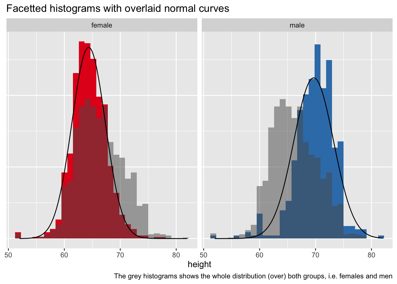
Actually there exists a simple solution
Not within ggplot2 per se, but if you are willing to use ggformula then it is pretty straight forward (source).
library(ggformula)## Loading required package: ggstance##
## Attaching package: 'ggstance'## The following objects are masked from 'package:ggplot2':
##
## geom_errorbarh, GeomErrorbarh## Loading required package: scales##
## Attaching package: 'scales'## The following object is masked from 'package:purrr':
##
## discard## The following object is masked from 'package:readr':
##
## col_factor## Loading required package: ggridges##
## New to ggformula? Try the tutorials:
## learnr::run_tutorial("introduction", package = "ggformula")
## learnr::run_tutorial("refining", package = "ggformula")gf_dens( ~ height | gender, data = d) %>%
gf_fitdistr(color = "red") %>%
gf_fitdistr(dist = "normal", color = "blue")## Warning: Removed 5 rows containing non-finite values (stat_density).## Warning: Removed 5 rows containing non-finite values (stat_fitdistr).
## Warning: Removed 5 rows containing non-finite values (stat_fitdistr).## Warning: Computation failed in `stat_fitdistr()`:
## 'densfun' must be supplied as a function or name
## Warning: Computation failed in `stat_fitdistr()`:
## 'densfun' must be supplied as a function or name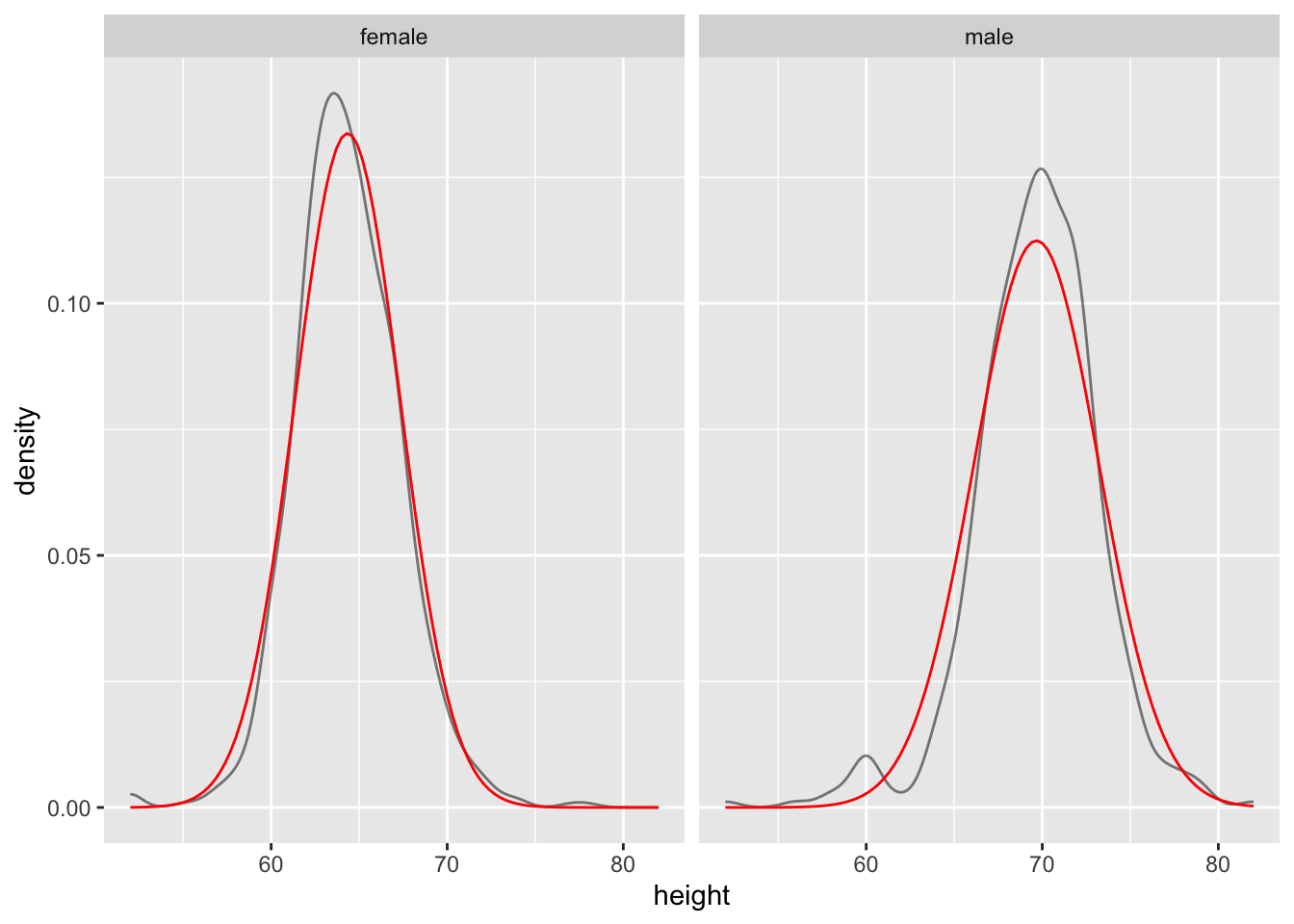
Update: Package ggh4x
I just discovered this ggplot extension, ggh4x, which provides some cool features, including overlay of normal densities.
#devtools::install_github("teunbrand/ggh4x")
library(ggh4x)
ggplot(d, aes(height)) +
geom_density() +
stat_theodensity(colour = "red") +
facet_wrap(~ gender)## Warning: Removed 5 rows containing non-finite values (stat_density).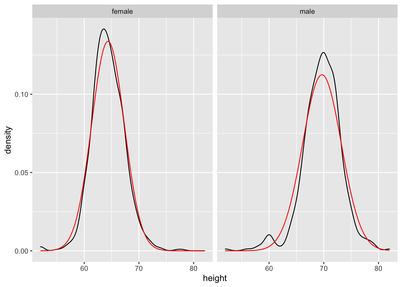
## $start.arg
## $start.arg$mean
## [1] 64.34442
##
## $start.arg$sd
## [1] 2.983323
##
##
## $fix.arg
## NULL
##
## $start.arg
## $start.arg$mean
## [1] 69.66787
##
## $start.arg$sd
## [1] 3.548706
##
##
## $fix.arg
## NULL
Nice and clean!