UPDATE: see update below based on comments from nmarkgraf.
UPDATE 2: I changed the theme to theme_minimal thanks to the comment from @neuwirthe.
UPDATE 3: A more efficient way to plot a discrete scale using viridis. Thanks to flying sheep; see way 4 below
The default color scheme in ggplot2 is suitable for many purposes, but, for instance, it is not suitable for b/w printing, and maybe not suitable for persons with limited color perception.
Of course, it is straightforward to edit the color scheme for one given plot. But how to change the default color scheme in ggplot2?
As it turns out, there are some helpful ways to address that – Kudos to @ben-bolker who helped me out on this Stackoverflow post.
Assume that we would like to use Viridis color scheme, because that’s nice for black-white printing and it works for people suffering from color blindness according to this source.
The viridis scales provide colour maps that are perceptually uniform in both colour and black-and-white. They are also designed to be perceived by viewers with common forms of colour blindness. See also https://bids.github.io/colormap/.
Setup
library(tidyverse)
library(viridis)
library(scales)

data(mtcars)
Change theme (UPDATE 2)
theme_set(theme_minimal())Continuous scales
We have to differentiate between continuous and discrete scales. Let’s start with the former.
There are two option settings for continuous color and fill used by ggplot2:
opts <- options()  # save old options

options(ggplot2.continuous.colour="viridis")
options(ggplot2.continuous.fill = "viridis")
Let’s try it out.
ggplot(data = mtcars, aes(x = hp, y = mpg, color = wt )) +
  geom_point()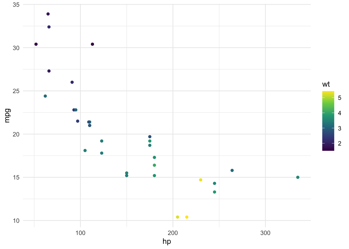
Works!
We can also map a discrete variable (such as am) to a continuous color scheme, without too much harm:
ggplot(data = mtcars, aes(x = hp, y = mpg, color = am )) +
  geom_point()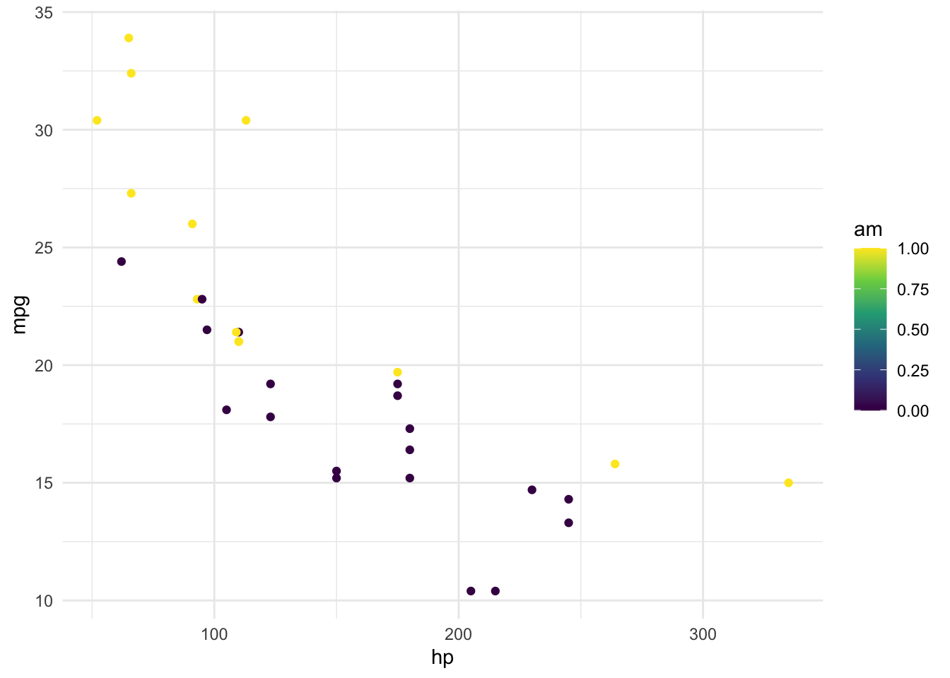
Of course, the legend does reveal that we have used a continuous mapping where a discrete mapping would be preferable.
Discrete scales, way 1
It appears that there’s no option we can call for discrete values. One reason may be that ggplot2 uses viridis as a default for ordered factors. So what we do is to define the color mapping variables as an ordered factor.
mtcars$am_f <- ordered(mtcars$am)Now we plot again:
ggplot(data = mtcars, aes(x = hp, y = mpg, color = am_f)) +
  geom_point()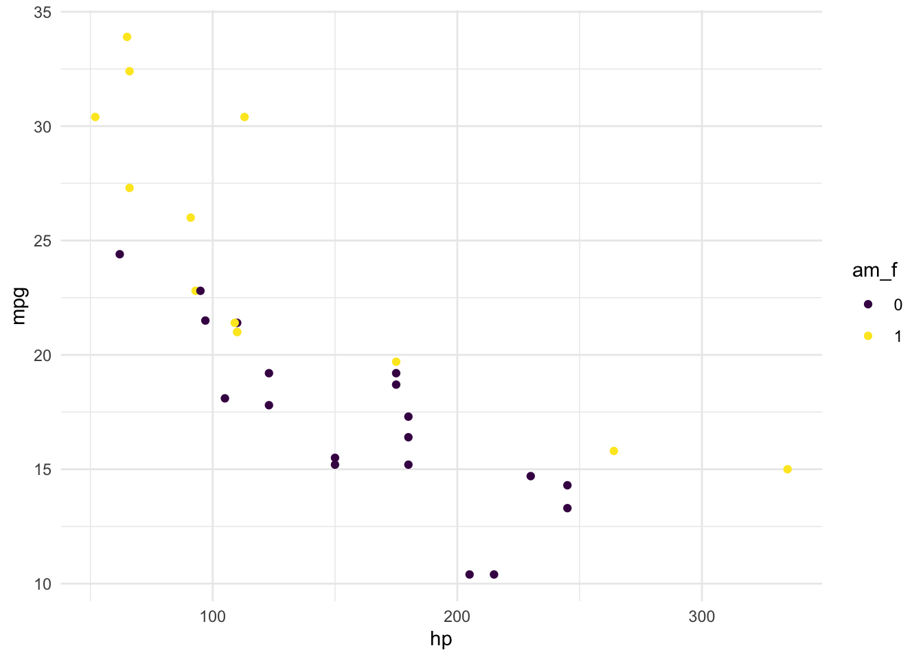
Works.
Discrete scales, way 2
Another option is to redefine scale_color_discrete() which is apparently silently called by each ggplot call.
scale_colour_discrete <- function(...) {
  scale_colour_manual(..., values = viridis::viridis(2))
}
Let’s take another color mapping variable for the sake of demonstration.
ggplot(data = mtcars, aes(x = hp, y = mpg, color = factor(vs))) +
  geom_point()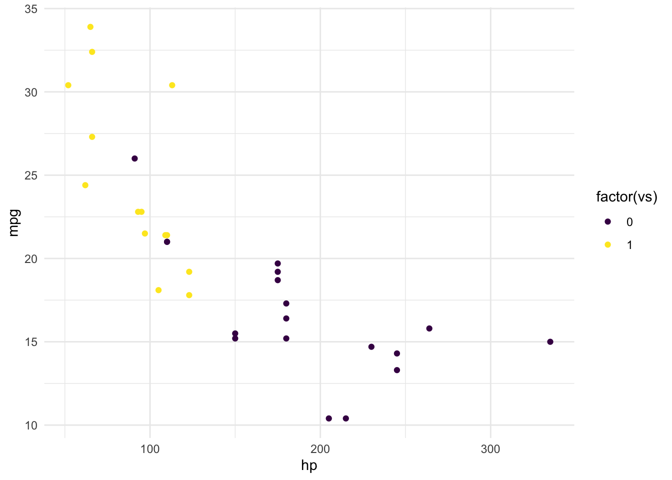
Works. But.
The downside of this approach is that we have to define the numbers of different colors upfront. This is a strong limitation. Consider the case that we would have defined 7 colors upfront.
scale_colour_discrete <- function(...) {
  scale_colour_manual(..., values = viridis::viridis(7))
}
That’s these ones:
show_col(viridis_pal()(7))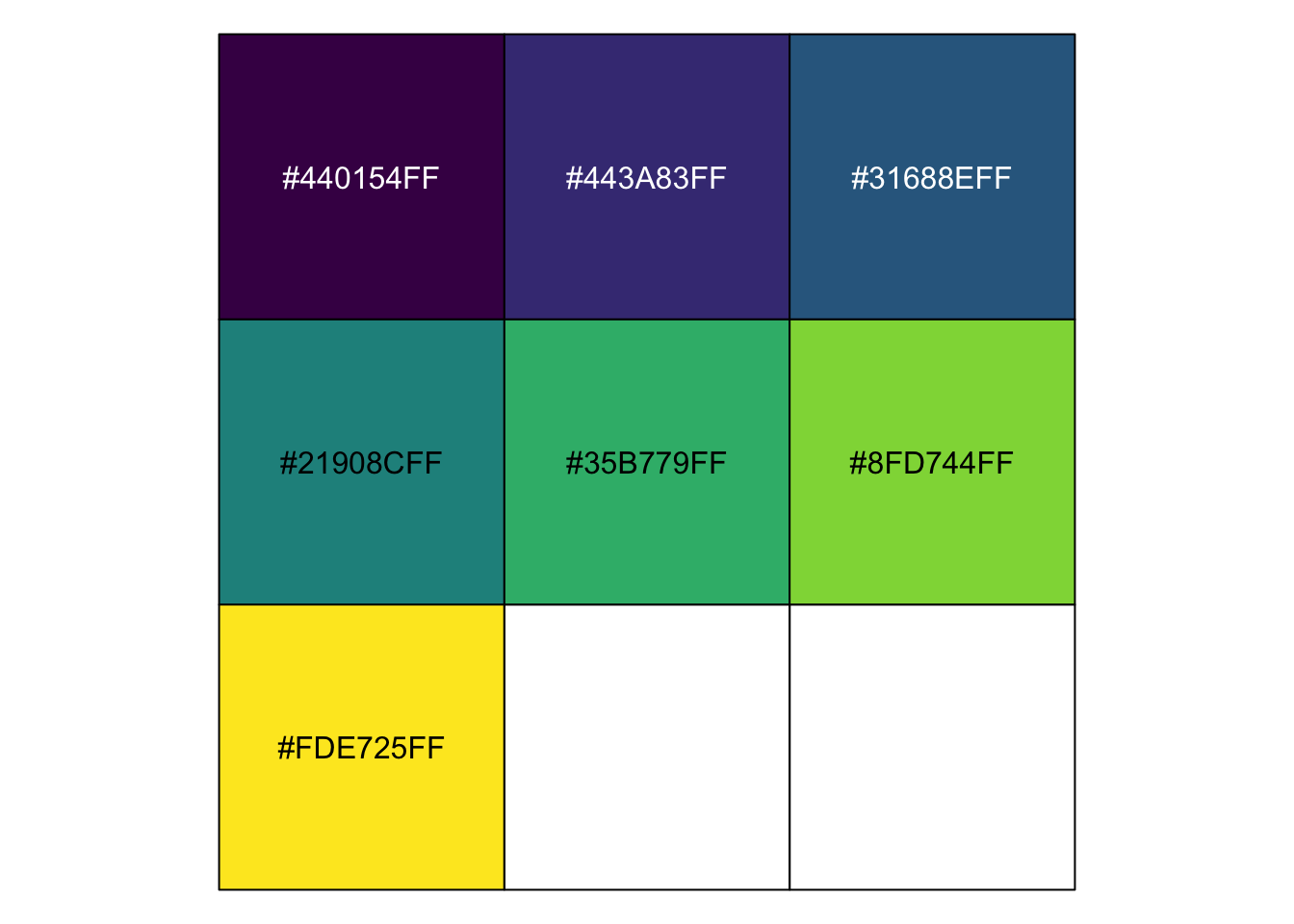
Now plot that:
ggplot(data = mtcars, aes(x = hp, y = mpg, color = factor(vs))) +
  geom_point()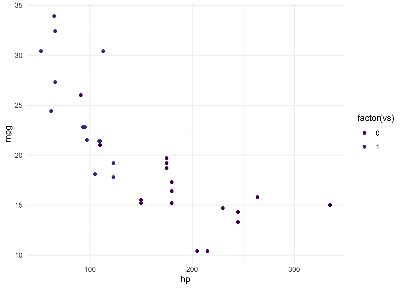
As can be seen, color #1 and #2 are selected. We would have needed that the first and the last color in this array would had been chosen.
Discrete scales, way 3 (Work around for way 2)
What we can do, of course, is to pick and choose and our own values. We can take a glimpse at the hex values from viridis, of course:
viridis_pal()(7)## [1] "#440154FF" "#443A83FF" "#31688EFF" "#21908CFF" "#35B779FF" "#8FD744FF"
## [7] "#FDE725FF"Now, we take #1, then #7, then #2, and so on, yielding:
viridis_qualitative_pal7 <- c("#440154FF", "#FDE725FF", "#443A83FF",
                              "#8FD744FF", "#31688EFF",  "#35B779FF",
                              "#21908CFF")
These values are now plugged into scale_color_manual():
scale_colour_discrete <- function(...) {
  scale_colour_manual(..., values = viridis_qualitative_pal7)
}
Let’s take some other dataset for the sake of demonstration:
data(tips, package = "reshape2")

ggplot(tips) +
  aes(x = total_bill, y = tip, color = day) +
  geom_point()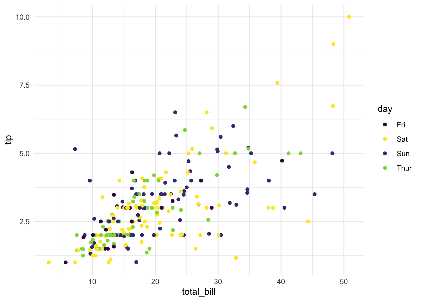
Works sufficiently well.
Discrete scales, way 4
Overwrite scale_color_discrete with the viridis variant of the function:
scale_colour_discrete <- scale_colour_viridis_dPlot with four groups:
ggplot(tips) +
  aes(x = total_bill, y = tip, color = day) +
  geom_point()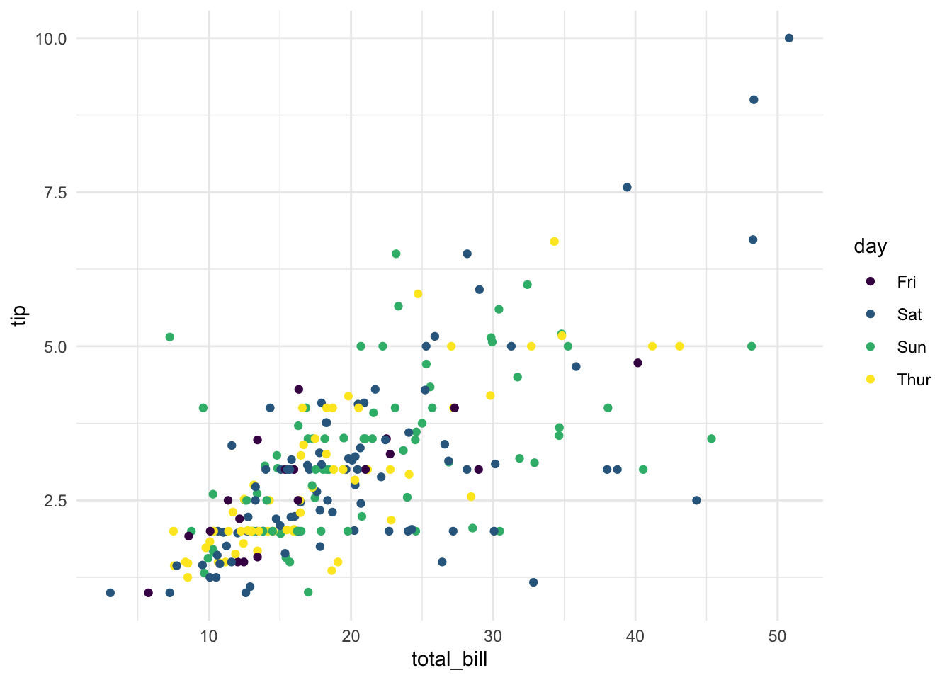
Or two groups:
ggplot(tips) +
  aes(x = total_bill, y = tip, color = sex) +
  geom_point()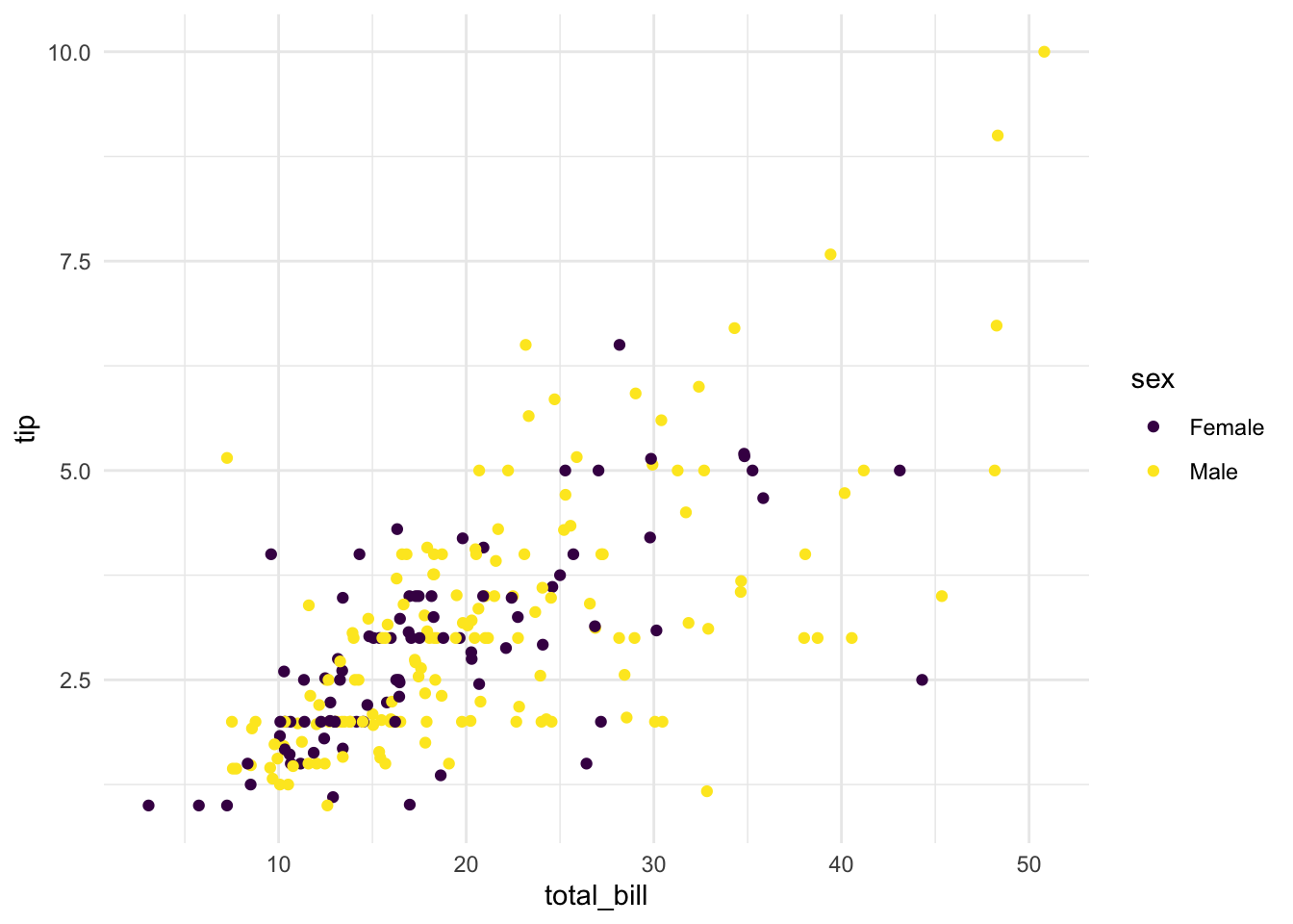
Works. And picks the correct colors. # UPDATE
This is an update triggered by comments from @nmarkgraf.
Bar graph
Let’s try a bargraph differentiating counts per group.
ggplot(tips) +
  aes(x = day, fill = day) +
  geom_bar()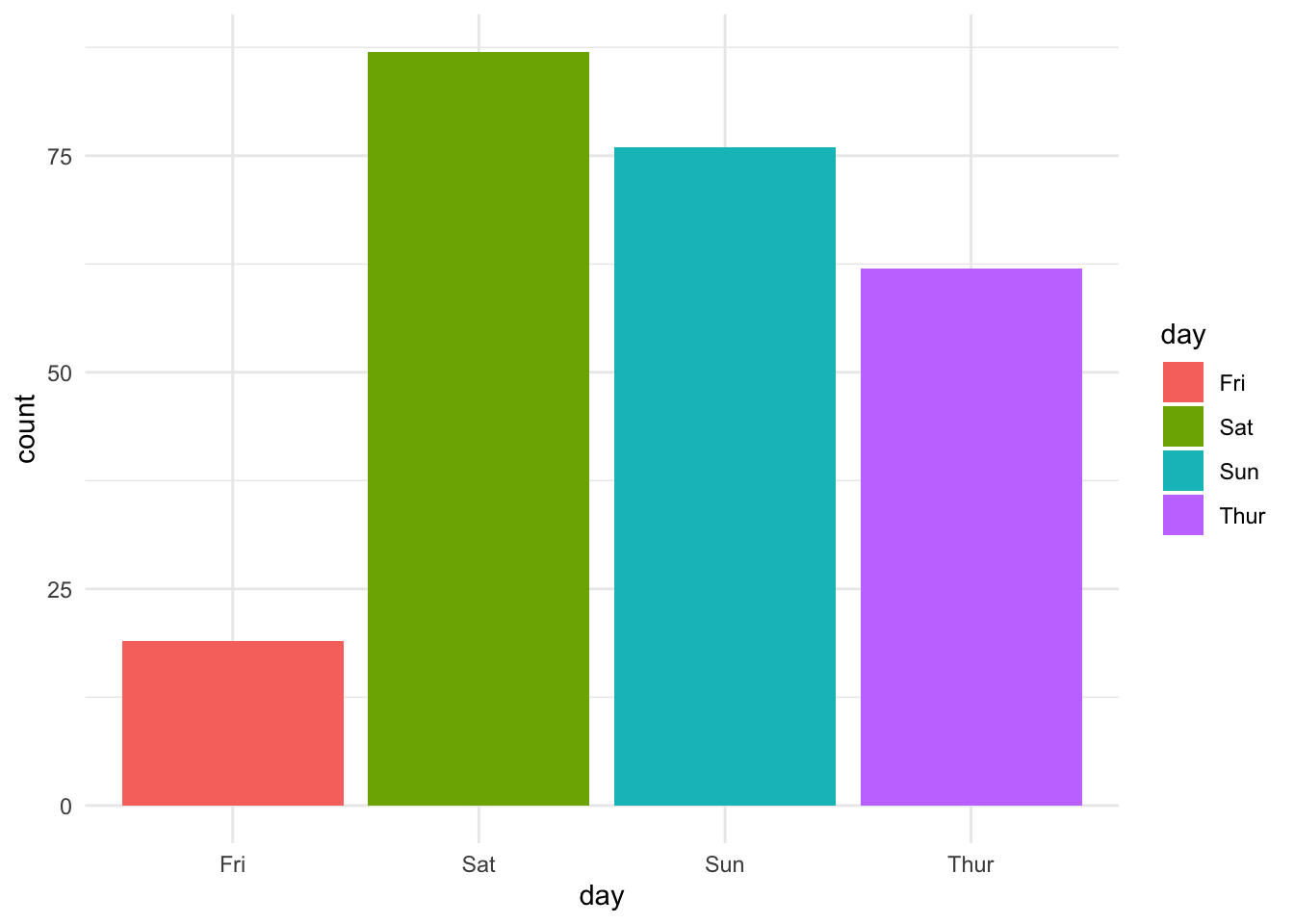
Did Not work.
Upps, we need to define the new content of scale_fill_discrete():
scale_fill_discrete <- function(...) {
   scale_fill_manual(..., values = viridis_qualitative_pal7)
}
Let’s try it.
ggplot(tips) +
  aes(x = day, fill = day) +
  geom_bar()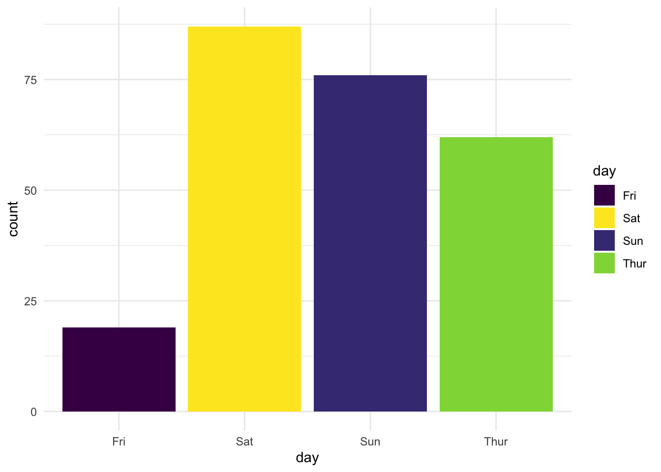
Works.
Thanks, nmarkgraf for pointing out!
Alternatively, using the geom col:
tips %>%
  count(day) %>%
  ggplot() +
    aes(x = day, y = n, fill = day) +
    geom_col()
Works.
Violin plots
Let’s map day to fill:
ggplot(tips) +
  aes(x = day, y = tip, fill = day) +
  geom_violin()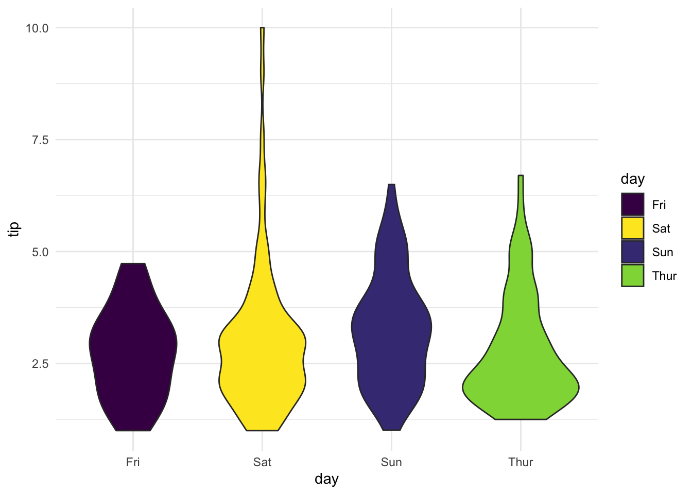
Works.
And now let’s map day to color:
ggplot(tips) +
  aes(x = day, y = tip, color = day) +
  geom_violin()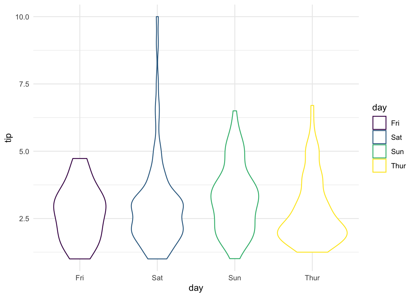
Works.