library(mosaic)
data(tips, package = "reshape2")
Recode sex:
tips %>%
  mutate(sex_n = case_when(
    sex == "Female" ~ 0,
    sex == "Male" ~ 1
  )) -> tips2
Fit model:
glm1 <- glm(sex_n ~ total_bill, data = tips2,
            family = "binomial")
Way 1
plotModel(glm1)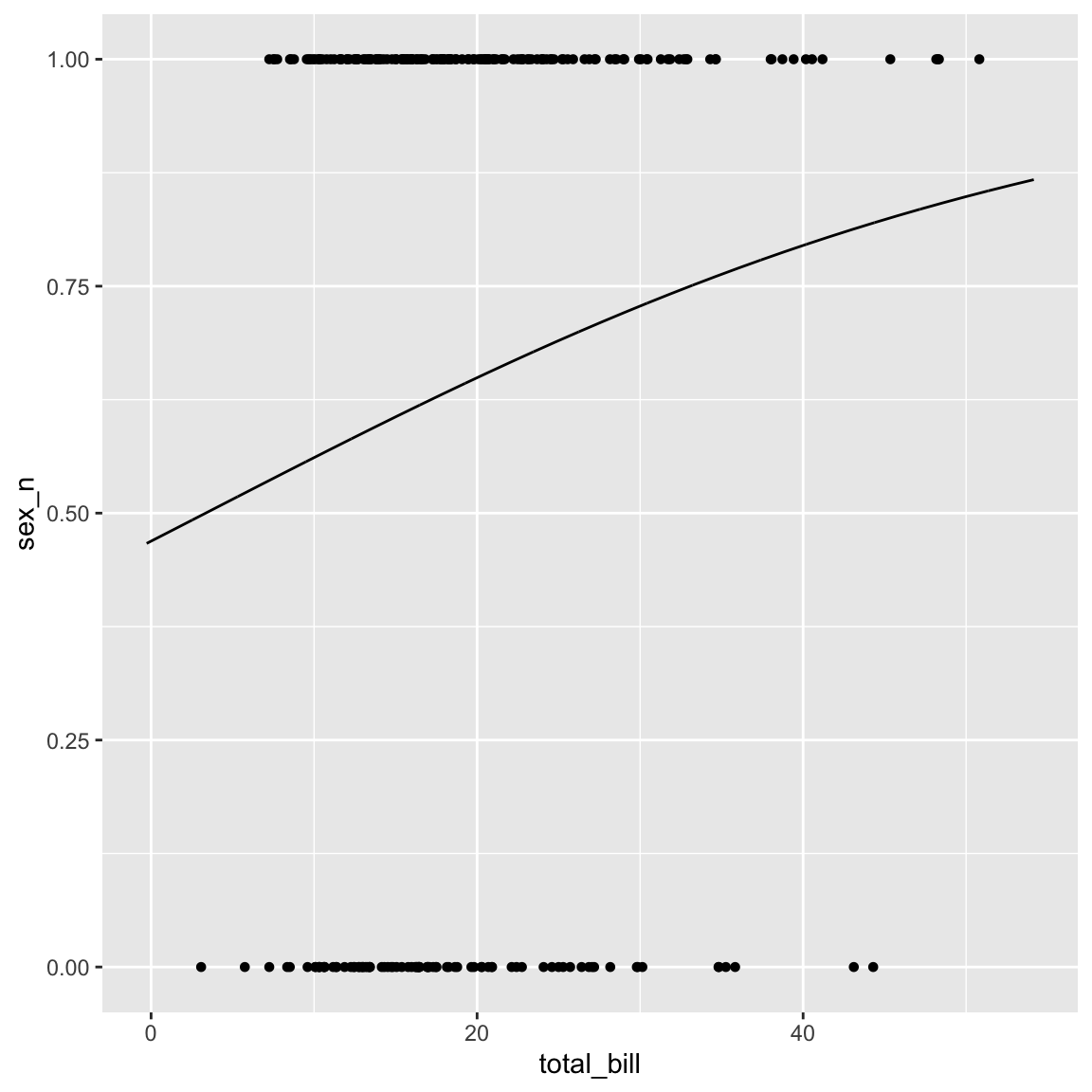
Way 2
Add predictions to data frame:
tips2 %>%
  mutate(pred = predict(glm1, newdata = tips, type = "response")) %>%
  mutate(predict_Male = pred > .5) -> tips3
Check values of predictions:
gf_histogram(~pred, data = tips3)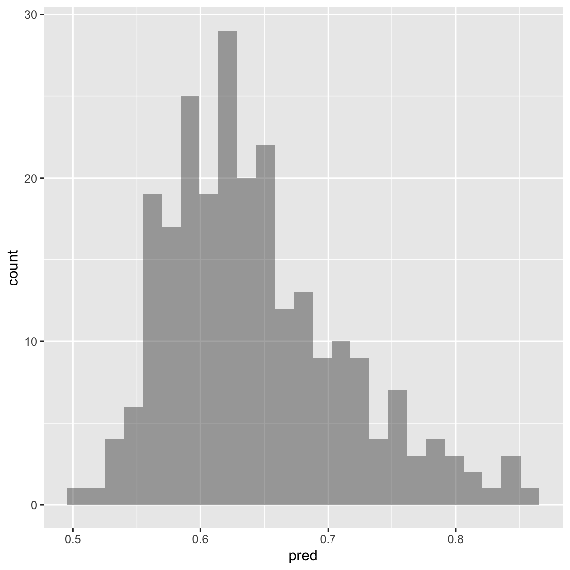
Plot jittered observed values (as points) plus prediction (as line):
gf_point(sex_n ~ total_bill, data = tips3,
         shape = ~sex,
         color = ~sex,
         size = 3,
         alpha = .5,
         position = "jitter") %>%
  gf_line(pred ~ total_bill, color = "grey40")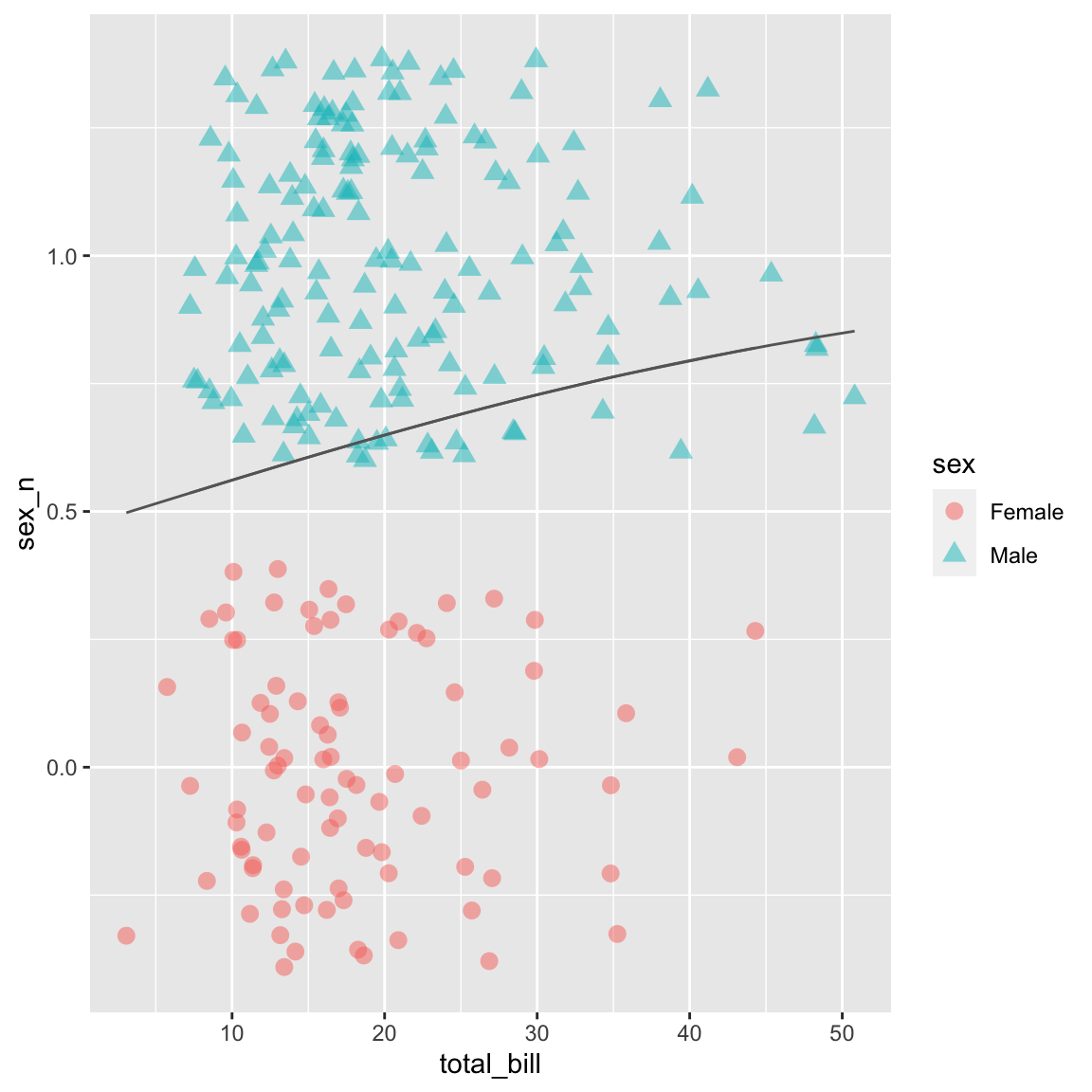
Way 3
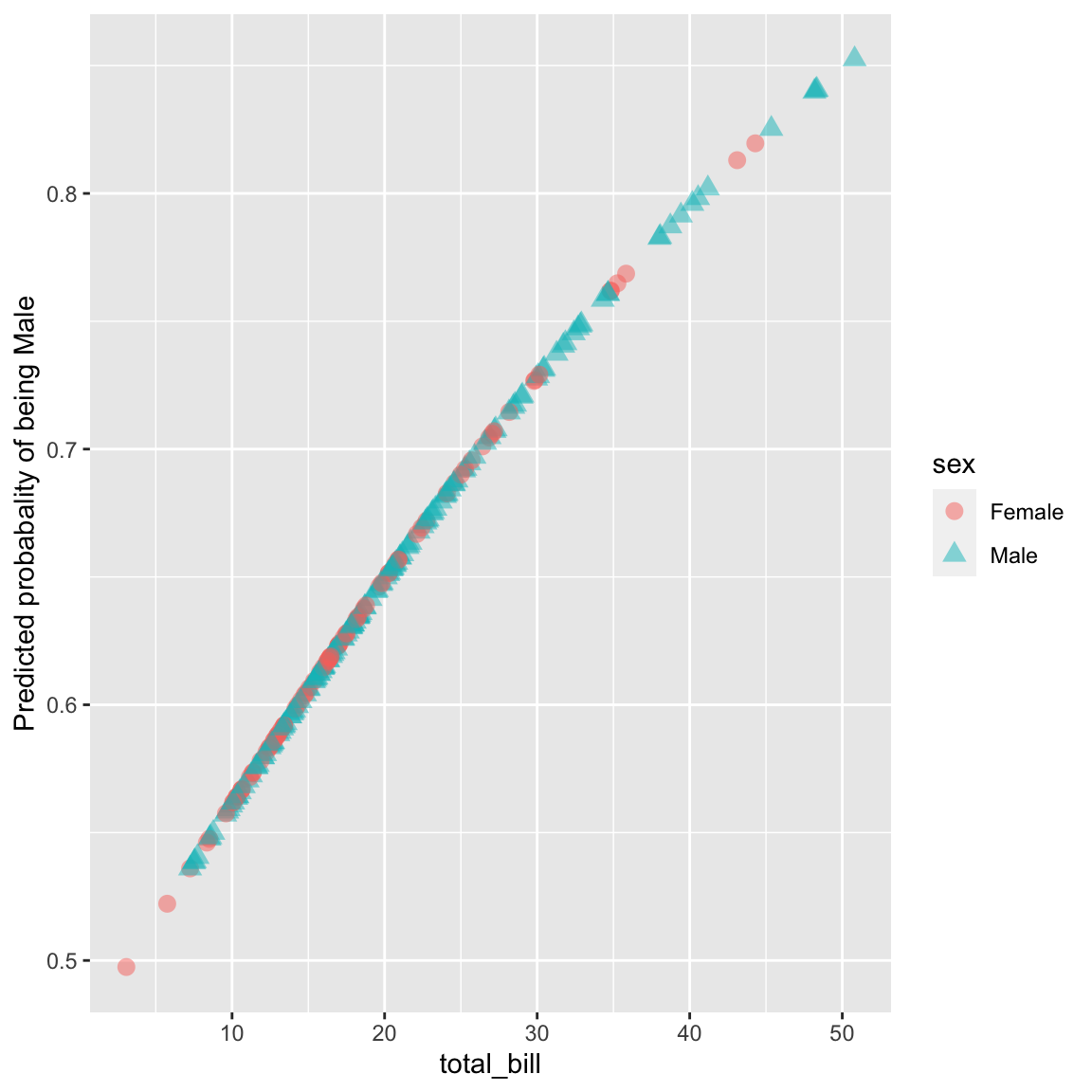
Plot predicted values as points
gf_point(pred ~ total_bill, data = tips3,
         color = ~sex,
         shape = ~sex,
         size = 3,
         alpha = .5) +
  labs(y = "Predicted probabality of being Male")