It is frequently stated that the sample mean is a good or even the best point estimator of the according population value. But why is that? In this post we are trying to get an intuition by using simulation inference methods.
Assume you played throwing coins with some one at some dark corner. “Some one” throws the coin 10 times, and wins 8 times (the guy was betting on heads, but that’s only for the sake of the story). With boiling suspicion (and empty pockets) you head home. Did this guy cheat? Was he playing tricks on you? It appears that the coin was unfair, ie., biased. It appears that 80% is a good estimator of the “true” value of the coin (for heads), does it not? But let’s try to see better why this is plausible or even rationale.
Let’s turn the question around, and assume for the moment that 80% is the true parameter, . If we were to draw many samples from this distribution (binomial with parameter ), how would our sample distribtion look like?
Let’s try it.
library(mosaic)
library(tidyverse)
pi = .8First, we let R draw 10000 samples of size from the () distribution where :
h0_samples <- do(10000) * rflip(n = 10, prob = pi)Plotting it gives us a “big picture” of typial and rare events:
gf_bar(~heads, data = h0_samples) +
  scale_x_continuous(breaks = 0:10)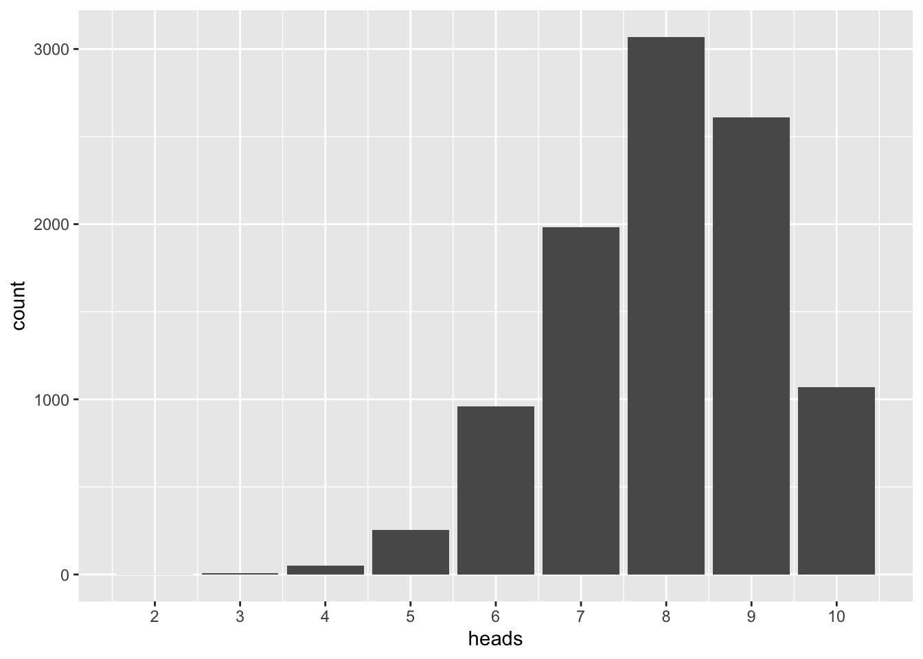
As can be seen, 8 (the sample value) is the most frequent value. In more elaborate terms, 8 is the most probable value if many samples of this size are drawn from the distribution. We see that our most frequent sample value represents the parameter well.
Divide all values by 10 (the sample size), and you will get mean values:
h0_samples %>%
  mutate(heads_avg = heads / 10) %>%
  summarise(heads_avg = mean(heads_avg),
            heads = mean(heads))
## heads_avg heads
## 1 0.79846 7.9846Similarly, say we draw many samples of from a normal distribution with and , the most frequent mean will be (approximately) :
h0_samples_norm <-
  do(10000) * mean(rnorm(n = 30, mean = 0, sd = 1))
gf_histogram(~mean, data = h0_samples_norm)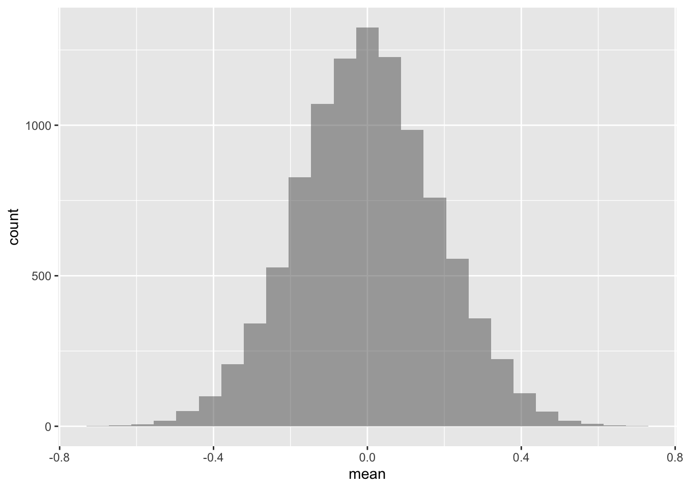
Intuitively, there is some plausibility in the results: The population mean is the most frequent value, hence it should appear often (most often) if we draw many samples.
Now we argue as follows:
If the data are distributed as given by the , then the most frequent value of the sample distribution will be the most likely value in the population.
But are my data really drawn from this distribution? There are infinitely many others. Why just this one, one may counter. Good point. One could argue that our conclusion is not warranted, because we have no evidence of preferring one distribution in favor of some other. One the other hand, some argue that all we know for sure is our data. And our data favors one certain value. So there is some rationality in choosing this value, because we know no other value for sure (actually we don’t have no other values at all).
We could ofcourse assign some probability on each distribution we deem plausible. Then we would get a distribution of parameters. That’s the Bayesian way. For the sake of simplicity, we will not pursue this path further in this post (although it is a great path).
Coming back to the coin examples; let’s do some more “hard” reasoning. It is well known that the distribution of a fair coin, flipped 10 times, follows this distribution:
Given the fact that how probable is, say, 8 hits? This probability is called likelihood; this function is called likelihood function. The likelihoods sum up to more than 100%.
The binomial coefficient is the same as chooose(n, k), in R.
choose(n = 10, k = 8) * .8^8 * (1-.8)^(10-8)## [1] 0.3019899More convenient is this off-the-shelf function.
dbinom(x = 8, size = 10, prob = .8)## [1] 0.3019899Let’s compute that for each of the possible 11 hits (0 to 10):
0:10 %>%
  dbinom(x = ., size = 10, prob = .8) %>%
  as_tibble() %>%
  add_column(hits = 0:10) %>%
  gf_col(value~hits, data = .) +
  scale_x_continuous(breaks = 0:10)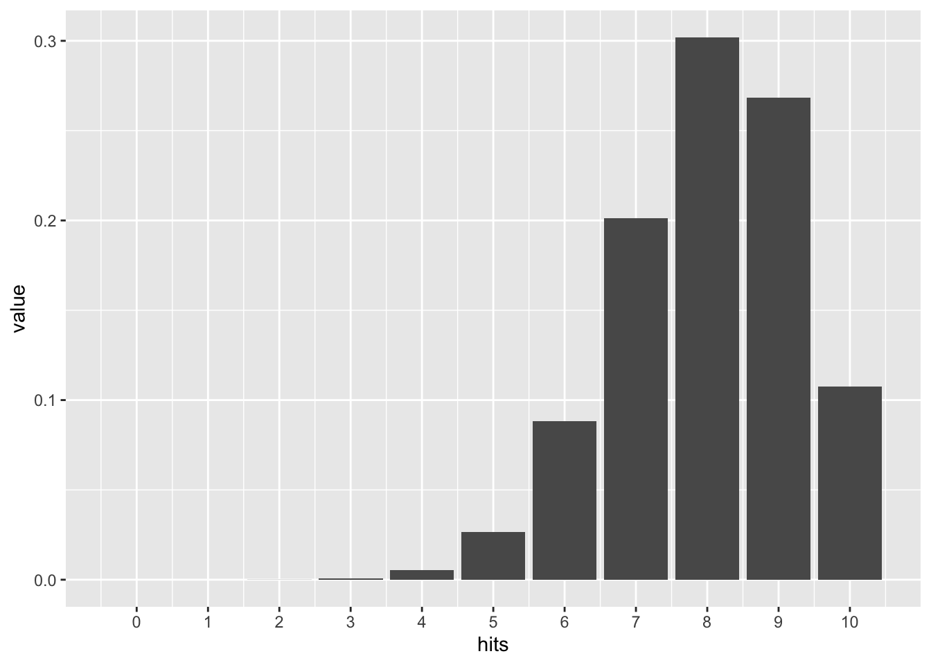
Looks similar to our simulation above, doesn’t it? Reassuring. Again, 8 of 10 hits is the most frequent.
Somewhat more stringent, we could compute the maximum of the likelihood function. To get the maximum of a function, one computes the first derivation, and then sets it to zero.
To make computation easier, we can take the logarithm of the likelihood function; taking the logarithm will not change the position of the maximum. But products will become sums by the log function, hence computation will become easier:
Now we take the first derivation with respect to , regarding the other variables as constants:
Setting this term to zero:
Moving the second term to the rhs:
Multiplying by :
Multiplying out:
Adding yields:
, rearringing:
Hence, the relative number of hits (in the sample) is the best estimator of . In the absence of other information, it appears plausible to take as the “best guess” for . In other words, maximizes the probabilty of .