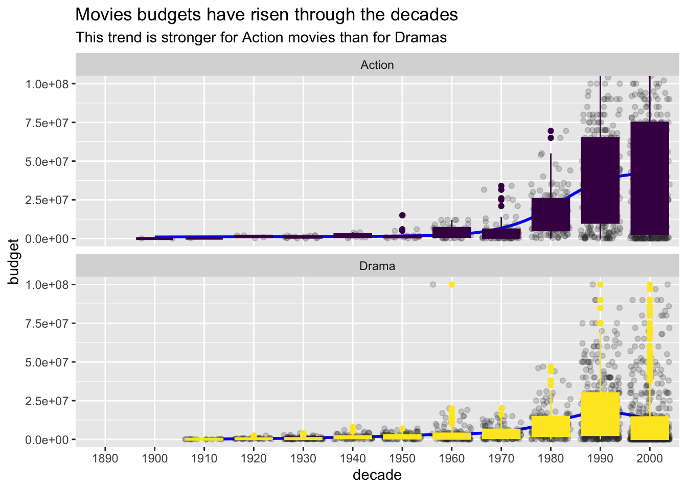
What’ a nice way to display distributional differences between a (larger) number of groups? Boxplots is one way to go. In addition, the raw data may be shown as dots, but should be demphasized. Third, a trend or big picture comparing the groups will make sense in some cases.
Ok, based on this reasoning, let’s do som visualizing. Let’s load some data (movies), and the usual culprits of packages.
library(tidyverse)
library(mosaic)

data(movies, package = "ggplot2movies")
Now let’s add a variable for decade as year is too fine grained..
movies %>%
  mutate(decade = year / 10) %>%
  mutate(decade = trunc(decade)) %>%  # trunkieren, abrunden
  mutate(decade = decade * 10) %>%
  mutate(decade = factor(decade)) -> movies
Next, let’s build a variable genre that comprises the different genres such as Action or Drama. Let’s focus on these two for sake of simplicity.
movies %>%
  select(title, decade, budget, rating, Action:Short) %>%
  gather(key = genre, value = is_true, -c(title, decade, budget, rating)) %>%
  filter(is_true == 1) %>%
  mutate(multiple_genre = duplicated(title)) %>%
  mutate(genre = ifelse(multiple_genre, "multiple", genre)) -> movies2
Now let’s plot:
movies2 %>%
  filter(genre %in% c("Action", "Drama")) %>%
  ggplot(aes(x = decade, y = budget, color = genre, fill = genre)) +
  facet_wrap(~genre, nrow = 2) +
  geom_smooth(aes(group = 1), se = FALSE, color = "blue") +
  geom_jitter(alpha = .2, color = "grey20") +
  geom_boxplot()  +
  coord_cartesian(ylim = c(0, 1e08)) +
  scale_fill_viridis_d() +
  scale_color_viridis_d() +
    labs(title = "Movies budgets have risen through the decades",
       subtitle = "This trend is stronger for Action movies than for Dramas",
       color = "",
       fill = "") +
  guides(color = "none", fill = "none")
## `geom_smooth()` using method = 'gam' and formula = 'y ~ s(x, bs = "cs")'## Warning: Removed 18343 rows containing non-finite values (`stat_smooth()`).## Warning: Removed 18343 rows containing non-finite values (`stat_boxplot()`).## Warning: Removed 18343 rows containing missing values (`geom_point()`).
Quite ok. The yellow color from Viridis is not doing the best job here. Note that we have zoomed in so that the movies with very high budgets are off-display (for the sake of better resolution of the majority of movies).