Let’s visualize a GLM (logistic regression).
First laod some data:
data(tips, package = "reshape2")Compute a glm:
glm_tips <- glm(sex ~ tip, data = tips,
            family = "binomial")
Plot the model using mosaic:
library(mosaic)
plotModel(glm_tips)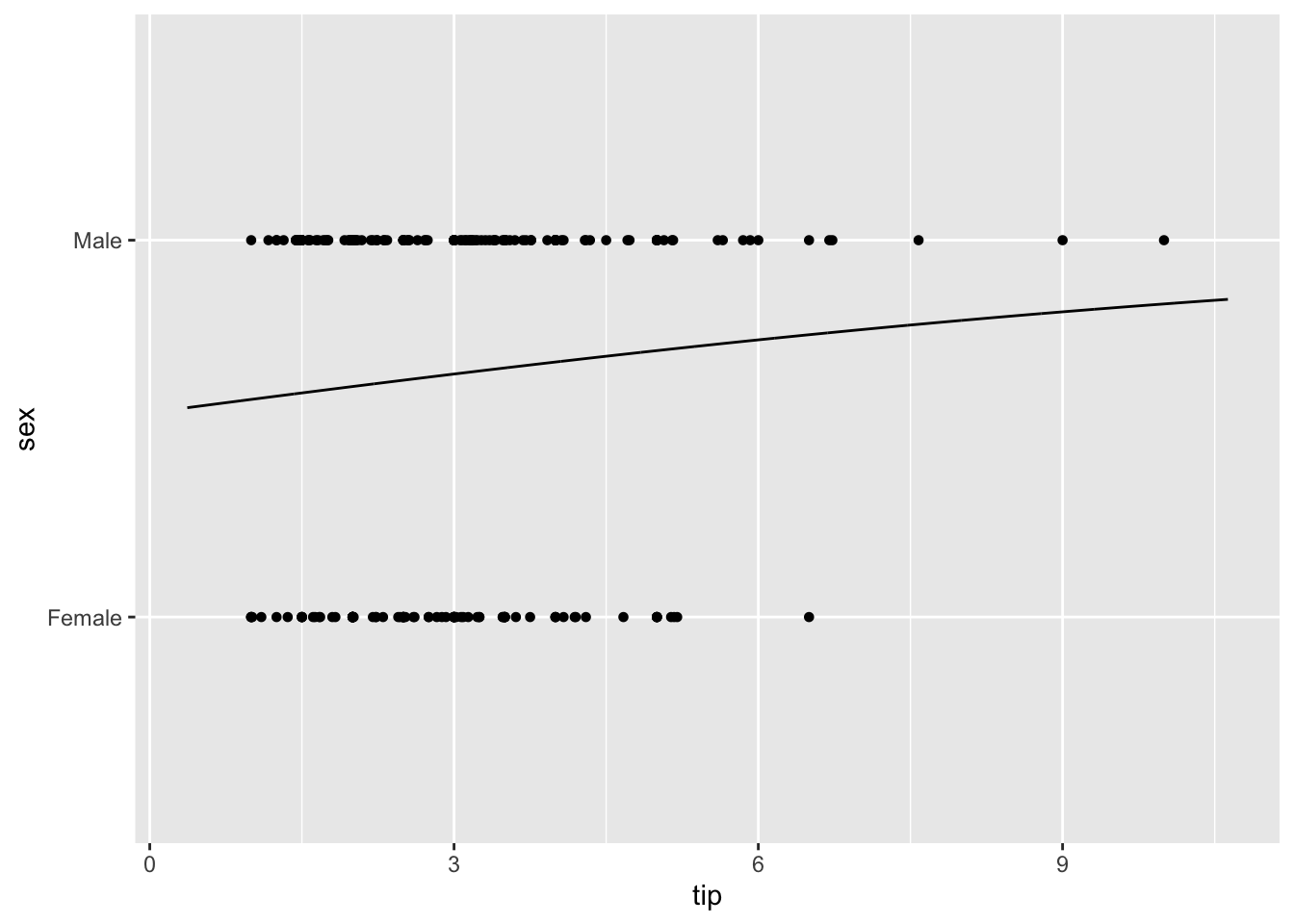
The curve does not look really s-typed (ogive) but that’s ok because the data suggest not a strong trend. The plot is not very beautiful either, but hey - it’s quick to produce 😁.