In a previous post, we have shed some light on the idea that populism - as manifested in AfD election results - is associated with socioeconomic deprivation, be it subjective or objective. We found some supporting pattern in the data, although that hypothesis is far from being complete; ie., most of the variance remained unexplained.
In this post, we test the hypothesis that AfD election results are negatively associated with the proportion of foreign nationals in a Wahlkreis. The idea is this: Many foreigners in your neighborhood, and you will get used to it. You will perceive those type of people as normal. To the contrary, if there are few of them, they are perceived as rather alien.
To be honest, this idea is rather vague; and it maybe built on the simple fact that in the eastern part of Germany, there are (relatively) few foreign nationals, as compared to the western parts of the country. However, animosity towards foreign nationals and AfD results are particularly strong in the East. Put shortly, much more theory would be needed to understand causal pathways explaining populism flourishing in some regions of Germany, particularly in Sachsen (Saxonia).
Packages
library(sf)
library(stringr)
library(tidyverse)
library(magrittr)
library(huxtable)
library(broom)
library(viridis)
Geo data
:attention: The election ratios are unequal to the district areas (as far as I know, not complete identical to the very least). So will need to get some special geo data. This geo data is available here and the others links on that page.
Download and unzip the data; store them in an appropriate folder. Adjust the path to your needs:
my_path_wahlkreise <- "~/Documents/datasets/geo_maps/btw17_geometrie_wahlkreise_shp/Geometrie_Wahlkreise_19DBT.shp"
file.exists(my_path_wahlkreise)
#> [1] TRUE
wahlkreise_shp <- st_read(my_path_wahlkreise)
#> Reading layer `Geometrie_Wahlkreise_19DBT' from data source `/Users/sebastiansauer/Documents/datasets/geo_maps/btw17_geometrie_wahlkreise_shp/Geometrie_Wahlkreise_19DBT.shp' using driver `ESRI Shapefile'
#> Simple feature collection with 299 features and 4 fields
#> geometry type:  MULTIPOLYGON
#> dimension:      XY
#> bbox:           xmin: 280387.7 ymin: 5235855 xmax: 921025.5 ymax: 6101444
#> epsg (SRID):    NA
#> proj4string:    +proj=utm +zone=32 +ellps=GRS80 +units=m +no_defs
glimpse(wahlkreise_shp)
#> Observations: 299
#> Variables: 5
#> $ WKR_NR    <int> 1, 2, 3, 4, 5, 6, 7, 8, 9, 10, 11, 12, 13, 14, 15, 1...
#> $ LAND_NR   <fctr> 01, 01, 01, 01, 01, 01, 01, 01, 01, 01, 01, 13, 13,...
#> $ LAND_NAME <fctr> Schleswig-Holstein, Schleswig-Holstein, Schleswig-H...
#> $ WKR_NAME  <fctr> Flensburg – Schleswig, Nordfriesland – Dithmarschen...
#> $ geometry  <simple_feature> MULTIPOLYGON (((543474.9057..., MULTIPOLY...
wahlkreise_shp %>%
  ggplot() +
  geom_sf()
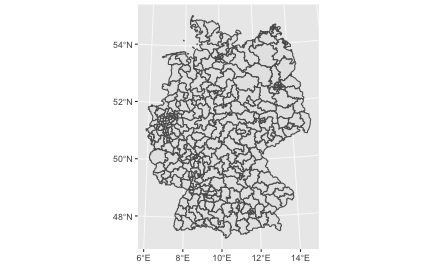
That was easy, right? The sf package fits nicely with the tidyverse. Hence not much to learn in that regard. I am not saying that geo data is simple, quite the contrary. But luckily the R functions fit in a well known schema.
Foreign nationals ratios
These data can as well be fetched from the same site as above, as mentioned above, we need to make sure that we have the statistics according to the election areas, not the administrative areas.
foreign_file <- "~/Documents/datasets/Strukturdaten_De/btw17_Strukturdaten-utf8.csv"

file.exists(foreign_file)
#> [1] TRUE


foreign_raw <- read_delim(foreign_file,
    ";", escape_double = FALSE,
    locale = locale(decimal_mark = ",",
        grouping_mark = "."),
    trim_ws = TRUE,
    skip = 8)  # skipt the first 8 rows

#glimpse(foreign_raw)
Jezz, we need to do some cleansing before we can work with this dataset.
foreign_names <- names(foreign_raw)

foreign_df <- foreign_raw

names(foreign_df) <- paste0("V",1:ncol(foreign_df))
The important columns are:
foreign_df <- foreign_df %>%
  rename(state = V1,
         area_nr = V2,
         area_name = V3,
         for_prop = V8,
         pop_move = V11,
         pop_migr_background = V19,
         income = V26,
         unemp = V47)  # total, as to March 2017
AfD election results
Again, we can access the data from the same source, the Bundeswahlleiter here. I have prepared the column names of the data and the data structure, to render the file more accessible to machine parsing. Data points were not altered. You can access my version of the file here.
elec_file <- "~/Documents/datasets/Strukturdaten_De/btw17_election_results.csv"
file.exists(elec_file)
#> [1] TRUE

elec_results <- read_csv(elec_file)
For each party, four values are reported:
- primary vote, present election
- primary vote, previous election
- secondary vote, present election
- secondary vote, previous election
The secondary vote refers to the party, that’s what we are interested in (column 46). The primary vote refers to the candidate of that area; the primary vote may also be of similar interest, but that’s a slightly different question, as it taps more into the approval of a person, rather to a party (of course there’s a lot overlap between both in this situation).
# names(elec_results)
afd_prop <- elec_results %>%
  select(1, 2, 46, 18) %>%
  rename(afd_votes = AfD3,
         area_nr = Nr,
         area_name = Gebiet,
         votes_total = Waehler_gueltige_Zweitstimmen_vorlauefig) %>%
  mutate(afd_prop = afd_votes / votes_total) %>%
  na.omit
In the previous step, we have selected the columns of interest, changed their name (shorter, English), and have computed the proportion of (valid) secondary votes in favor of the AfD.
Match foreign national rated to AfD votes for each Wahlkreis
wahlkreise_shp %>%
  left_join(foreign_df, by = c("WKR_NR" = "area_nr")) %>%
  left_join(afd_prop, by = "area_name") -> chloro_data
Plot geo map with afd votes
chloro_data %>%
  ggplot() +
  geom_sf(aes(fill = afd_prop)) -> p1
p1
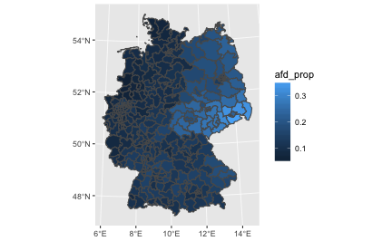
We might want to play with the fill color, or clean up the map (remove axis etc.)
p1 + scale_fill_distiller(palette = "Spectral") +
  theme_void()
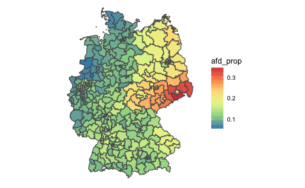
Geo map (of election areas) with foreign national data
chloro_data %>%
  ggplot() +
  geom_sf(aes(fill = for_prop)) +
  scale_fill_distiller(palette = "Spectral") +
  theme_void() -> p2
p2
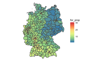
As can be seen from the previous figure, foreign nationals are relatively rare in the East, but tend to concentrate on the big cities such as Munich, Frankfurt, and the Ruhr area.
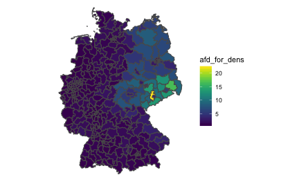
“AfD to foreigner density”
In a similar vein, we could compute the ratio of AfD votes and foreigner quote. That would give us some measure of covariability. Let’s see.
chloro_data %>%
  mutate(afd_for_dens = afd_prop / (for_prop/100)) -> chloro_data

chloro_data %>%
  ggplot +
  geom_sf(aes(fill = afd_for_dens)) +
  theme_void() +
  scale_fill_viridis()
Let’s check that.
chloro_data %>%
  select(afd_for_dens, afd_prop, for_prop) %>%
  as.data.frame %>%
  slice(1:3)
#> # A tibble: 3 x 4
#>   afd_for_dens afd_prop for_prop          geometry
#>          <dbl>    <dbl>    <dbl>  <simple_feature>
#> 1         1.20   0.0684      5.7 <MULTIPOLYGON...>
#> 2         1.21   0.0653      5.4 <MULTIPOLYGON...>
#> 3         1.71   0.0854      5.0 <MULTIPOLYGON...>
The diagram shows that in relation to foreigner rates, the AfD votes are strongest in Saxonian Wahlkreise primarily. Second, the East is surprisingly strong more “AfD dense” compared to the West. Don’t forget that this measure is an indication of co-occurrence, not of absolute AfD votes.
Correlation of foreign national quote and AfD votes
A simple, straight-forward and well-known approach to devise association strength is Pearson’s correlation coefficient. Oldie but Goldie. Let’s depict it.
chloro_data %>%
  select(for_prop, afd_prop, area_name) %>%
  ggplot +
  aes(x = for_prop, y = afd_prop) +
  geom_point() +
  geom_smooth()
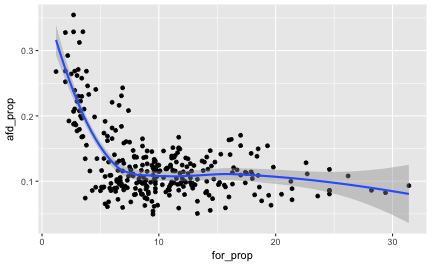
The pattern exhibited is quite striking: What we see might easily fit an exponential distribution: When foreigner rate begins to augment, the AfD success shrinks strongly, but this trend comes to an end as soon as some “saturation” process starts, maybe around some 8% of foreign national quote. It would surely be simplistic to speak of a “healthy proportion of around 8% foreigners”, to fence populism. However, the available data shows a quite obvious pattern.
The correlation itself is
chloro_data %>%
  select(for_prop, afd_prop, area_name) %>%
  as.data.frame %T>%
  summarise(cor_afd_foreigners = cor(afd_prop, for_prop)) %>%
  do(tidy(cor.test(.$afd_prop, .$for_prop)))
#>   estimate statistic  p.value parameter conf.low conf.high
#> 1   -0.465     -9.05 1.98e-17       297   -0.549    -0.371
#>                                 method alternative
#> 1 Pearson's product-moment correlation   two.sided
That is, $r = -.46$, which is quite strong an effect.
EDIT: A comment by Ilya Kashnitsky (@ikashnitsky) suggested to separate the trends for eastern and Western German electoral districts.
Let’s try that.
First, we create a binary variable coding East vs. West:
unique(chloro_data$LAND_NAME)
#>  [1] Schleswig-Holstein     Mecklenburg-Vorpommern Hamburg
#>  [4] Niedersachsen          Bremen                 Brandenburg
#>  [7] Sachsen-Anhalt         Berlin                 Nordrhein-Westfalen
#> [10] Sachsen                Hessen                 Thüringen
#> [13] Rheinland-Pfalz        Bayern                 Baden-Württemberg
#> [16] Saarland
#> 16 Levels: Baden-Württemberg Bayern Berlin Brandenburg Bremen ... Thüringen
Being a German citizen, I know which is East; although I am unsure about Berlin.
east <- c("Mecklenburg-Vorpommern", "Brandenburg", "Sachsen-Anhalt", "Sachsen", "Thüringen")

chloro_data %>%
  mutate(east = LAND_NAME %in% east) -> chloro_data


chloro_data %>%
  select(east, LAND_NAME) %>%
  count(LAND_NAME, east)
#> Simple feature collection with 16 features and 3 fields
#> geometry type:  GEOMETRY
#> dimension:      XY
#> bbox:           xmin: 280387.7 ymin: 5235855 xmax: 921025.5 ymax: 6101444
#> epsg (SRID):    NA
#> proj4string:    +proj=utm +zone=32 +ellps=GRS80 +units=m +no_defs
#> # A tibble: 16 x 4
#>                 LAND_NAME  east     n          geometry
#>                    <fctr> <lgl> <int>  <simple_feature>
#>  1      Baden-Württemberg FALSE    38 <MULTIPOLYGON...>
#>  2                 Bayern FALSE    46 <POLYGON ((61...>
#>  3                 Berlin FALSE    12 <POLYGON ((79...>
#>  4            Brandenburg  TRUE    10 <POLYGON ((89...>
#>  5                 Bremen FALSE     2 <MULTIPOLYGON...>
#>  6                Hamburg FALSE     6 <MULTIPOLYGON...>
#>  7                 Hessen FALSE    22 <POLYGON ((49...>
#>  8 Mecklenburg-Vorpommern  TRUE     6 <MULTIPOLYGON...>
#>  9          Niedersachsen FALSE    30 <MULTIPOLYGON...>
#> 10    Nordrhein-Westfalen FALSE    64 <MULTIPOLYGON...>
#> 11        Rheinland-Pfalz FALSE    15 <POLYGON ((45...>
#> 12               Saarland FALSE     4 <POLYGON ((36...>
#> 13                Sachsen  TRUE    16 <POLYGON ((75...>
#> 14         Sachsen-Anhalt  TRUE     9 <POLYGON ((72...>
#> 15     Schleswig-Holstein FALSE    11 <MULTIPOLYGON...>
#> 16              Thüringen  TRUE     8 <POLYGON ((68...>
And now let’s plot again:
chloro_data %>%
  select(for_prop, afd_prop, area_name, east) %>%
  ggplot +
  aes(x = for_prop, y = afd_prop) +
  geom_point() +
  geom_smooth(aes(color = east), method = "lm")
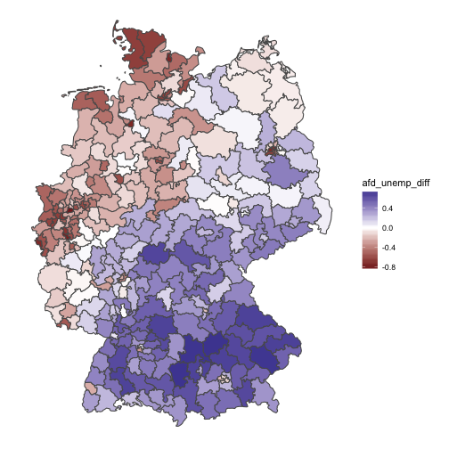
Quite remarkably, we see that the association in the West is weak; in the East it is (comparatively) strong. Many foreigners, fewer AfD votes. So we might update our thinking saying that there appears to be different mindsets between East and West in this regard.
Of course, this is observational data only, so all this reasoning should be taken cum grano salis. There are surely more variables in the play, so we cannot be sure what true influential (causal) patterns look like. Ilya suggested that some additional variable(s) with different distributions in East and West may explain the data (Simpson case).
BTW: Data are now available in my package pradadata on Github, and can be installed via
devtools::install_github("sebastiansauer/pradadata")
Regression residuals of predicting foreigner quote by afd_score
Let’s predict the AfD vote score taking the unemployment as an predictor. Then let’s plot the residuals to see how good the prediction is, ie., how close (or rather, far) the association of unemployment and AfD voting is.
lm2 <- lm(afd_prop ~ for_prop, data = chloro_data)

glance(lm2)
#>   r.squared adj.r.squared  sigma statistic  p.value df logLik  AIC  BIC
#> 1     0.216         0.213 0.0484      81.8 1.98e-17  2    482 -958 -947
#>   deviance df.residual
#> 1    0.697         297
tidy(lm2)
#>          term estimate std.error statistic  p.value
#> 1 (Intercept)  0.17513   0.00596     29.40 5.90e-90
#> 2    for_prop -0.00471   0.00052     -9.05 1.98e-17


chloro_data %>%
  mutate(afd_lm2 = lm(afd_prop ~ for_prop, data = .)$residuals) -> chloro_data
We have an $R^2$ of .21, quite a bit. Maybe the most important message: For each percentage point more foreigners, the AfD results decreases about a half percentage point.
And now plot the residuals:
chloro_data %>%
  select(afd_lm2) %>%
  ggplot() +
  geom_sf(aes(fill = afd_lm2)) +
  scale_fill_gradient2() +
  theme_void()
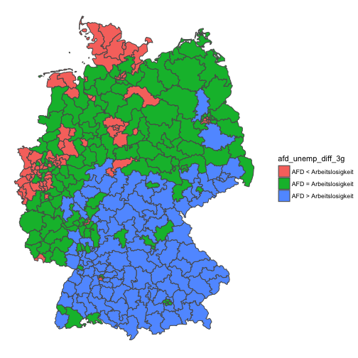
Interesting! This model shows a clear-cut picture: The eastern part is too “afd-ic” for its foreigner ratio; the North-West is less afd-ic than what would be expected by the foreigner rate. The rest (middle and south) parts over-and-above show the AfD levels that would be expected by their foreigner rate.
EDIT: Let’s include east as a predictor to the linear model:
lm3 <- lm(afd_prop ~ for_prop*east, data = chloro_data)

glance(lm3)
#>   r.squared adj.r.squared  sigma statistic  p.value df logLik   AIC   BIC
#> 1     0.672         0.669 0.0314       202 3.85e-71  4    612 -1215 -1196
#>   deviance df.residual
#> 1    0.291         295
tidy(lm3)
#>                term  estimate std.error statistic  p.value
#> 1       (Intercept)  0.112378   0.00495    22.692 1.17e-66
#> 2          for_prop -0.000371   0.00040    -0.928 3.54e-01
#> 3          eastTRUE  0.166620   0.01302    12.798 3.97e-30
#> 4 for_prop:eastTRUE -0.013637   0.00302    -4.521 8.93e-06
R squared increased dramatically, fostering the line of thought in the EDIT above. Now, we see that the general foreigner quote is not significiant anymore; we may infer that it plays no important role. But whether a wahlrkeis is East or not does play a strong role. For the East, the slope decreases quite a bit indicating some negative effect on foreigner quotes to AfD success.
Thanks Ilya Kashnitsky (@ikashnitsky)!
Conclusion
The regression model provides a quite clear-cut picture. The story of the data may thus be summarized in easy words: The higher the foreigner ratio, the lower the AfD ratio. However, this is only part of the story. The foreigner explains a rather small fraction of AfD votes. Yet, given the multitude of potential influences on voting behavior, a correlation coefficient of -.46 is strikingly strong.