A convenient and well applicable visualization for comparing groups with respect to a metric variable is the boxplot. However, often, comparing means is accompanied by t-tests, ANOVAs, and friends. Such tests test the mean, not the median, and hence the boxplot is presenting the tested statistic. It would be better to align test and diagram. How can that be achieved using ggplot2? This posts demonstrates some possibilities.
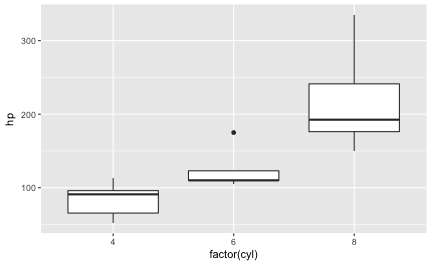
First, let’s plot a boxplot.
Don’t forget to load the usual culprits.
library(tidyverse)
mtcars %>%
  ggplot +
  aes(x = factor(cyl), y = hp) +
  geom_boxplot() -> p1

p1

Way one: Let ggplot compute the summary statistic
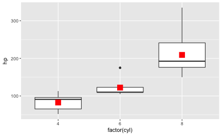
Now, let’s say we would like to add the mean for each group of cyl to the diagram. ggplot2 provides a function that will calculate summary statistics, such as the mean, for us: stat_summary. Let’s add this “layer” to the diagram:
p1 +
  stat_summary(fun.y = "mean", geom = "point", size = 5, color = "red", shape = 15)

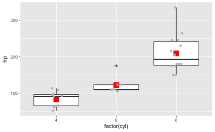
In addition to these two geoms (boxplot and ret dot for the mean), or as a replacement of one of these geoms, we may want to plot the raw data:
p1 +
  stat_summary(fun.y = "mean", geom = "point", size = 5, color = "red", shape = 15) +
  geom_jitter(color = "grey", width = .1)

Way 2: Compute the summary statistic manually
One simple way to compute a summary statistic is this:
1. Take mtcars.
2. Group this dataframe by column "cyl".
3. Summarise the column "hp" by using the "mean" function (applies to each group as defined in step 2).
4. Save the result as a new dataframe.
The dplyr (tidyverse) code is a quite literal translation of this pseudo-syntax:
mtcars %>%
  group_by(cyl) %>%
  summarise(hp = mean(hp)) -> mtcars2
mtcars2
#> # A tibble: 3 x 2
#>     cyl        hp
#>   <dbl>     <dbl>
#> 1     4  82.63636
#> 2     6 122.28571
#> 3     8 209.21429
Now we can add a layer of points using this new dataframe (mtcars2):
mtcars %>%
  ggplot +
  aes(x = factor(cyl), y = hp) +
  geom_boxplot() +
  geom_point(data = mtcars2, color = "red", shape = 15, size = 5)

Debrief
One may say, just don’t run a t-test, do a Wilcoxon, and everything is fine. Agreed. Some say that the t-test has more power than the Wilcoxon, but I personally don’t think that is much of an issue. However, my goal is not to judge about which test “is better”, but just to show some ways of plotting raw (detail) data alongside with a summary statistic.