Plotting a function is often helpful to better understand what’s going on. Plotting curves in R base is simple by virtue of function curve. But how to draw curves using ggplot2?
That’s a little bit more complicated by can still be accomplished by 1-2 lines.
library(ggplot2)
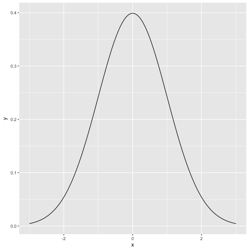
Normal curve
p <- ggplot(data = data.frame(x = c(-3, 3)), aes(x))

p + stat_function(fun = dnorm, n = 101)

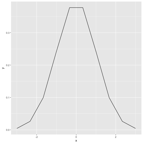
stat_function is some kind of parallel function to curve. The parameter n tells ggplot how finely granulated the curve should be. Compare to n=10:
p + stat_function(fun = dnorm, n = 10)

Logistic curve
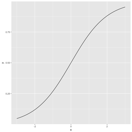
The logitistic curve plays an eniment role in many statistical methods, e.g., regression for binary events, and Rasch model in psychometric. It is sometimes called “s-type” curve (or “ogive”) due to its form vaguely resembling an “S”:
scurve <- function(x){
  y <- exp(x) / (1 + exp(x))
  return(y)
}

p + stat_function(fun = scurve, n = 100)

As our function does not have a prebottled version in base R, we have defined a function beforehand. That function is then passed over to ggplot2.
Alternatively, we could have done that in one step:
p + stat_function(fun = function(x) exp(x)/(1+exp(x)), n = 100)

Which is shorter but somewhat less readable.
Ln-Function
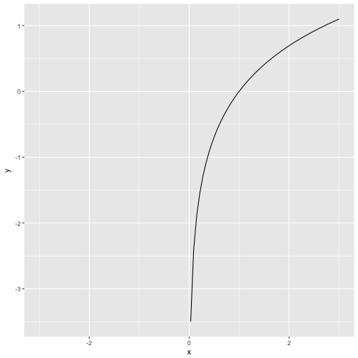
Now the principle is clear and we can readily apply it to whatever function we wish. Let’s take the natural logarithm (log in R) as a final example.
p + stat_function(fun = log, n = 100)
## Warning in .Primitive("log")(x_trans): NaNs produced
## Warning: Removed 50 rows containing missing values (geom_path).

Note that the ln-function is not defined for negative values (zero gives -Inf).