Frequently, someones says that some indicator variable X “explains” some proportion of some target variable, Y. What does this actually mean? By “mean” I am trying to find some intuition that “clicks” rather than citing the (well-known) formualas.
To start with, let’s load some packages and make up some random data.
library(tidyverse)
n_rows <- 100
set.seed(271828)

df <- data_frame(
  exp_clean = rnorm(n = n_rows, mean = 2, sd = 1),
  cntrl_clean = rnorm(n = n_rows, mean = 0, sd = 1),
  exp_noisy = exp_clean + rnorm(n = n_rows, mean = 0, sd = 3),
  cntrl_noisy = cntrl_clean + rnorm(n = n_rows, mean = 0, sd = 3),
  ID = 1:n_rows)
Here, we drew 100 cases from the population of the “experimental group” (mue = 2) and 100 cases from the control group (mue = 0). We will investigate the effect of noise on our data. So for both groups we make up noisy data: We just add some random noise on the existing data.
To easily plot the data, it is useful to “gather” or “melt” the data from wide to long format.
df_long <-
  df %>%
  gather(key = group, value = value, -ID) %>%
  separate(col = group, into = c("group", "noise_level"), sep = "_")
Summary data
It is useful to put some summary data in its own dataframe in a structured way:
df_sum <-
  df_long %>%
  group_by(group, noise_level) %>%
  summarise(value_mean = mean(value)) %>%
  ungroup

knitr::kable(df_sum)
| group | noise_level | value_mean |
|---|---|---|
| cntrl | clean | -0.1035629 |
| cntrl | noisy | 0.1352067 |
| exp | clean | 1.9834936 |
| exp | noisy | 1.9421094 |
Clean data vs. noisy data
For plotting purposes, it will be handy to have the group means in the main dataframe:
df_sum_noise_level <-
  df_sum %>%
  select(-group) %>%
  group_by(noise_level) %>%
  summarise_all(funs(mean))

knitr::kable(df_sum_noise_level)
| noise_level | value_mean |
|---|---|
| clean | 0.9399653 |
| noisy | 1.0386580 |
df_long_noise_level <- df_long %>%
  left_join(df_sum_noise_level, by = "noise_level")
Joining operations basically merge two dataframes matched by some matchings columns (by argument).
Now, let’s plot the data including the mean value and the within variation.
df_long_noise_level %>%
  ggplot +
  aes(x = ID, y = value) +
  facet_wrap(~noise_level) +
  geom_point() +
  geom_hline(data = df_sum_noise_level, aes(yintercept = mean(value_mean)), color = "firebrick") +
  geom_linerange(aes(ymin = value_mean, ymax = value), color = "grey80") +
  labs(title = "overall mean and variation in clean vs. noisy data") +
  coord_cartesian(ylim = c(-8,8))
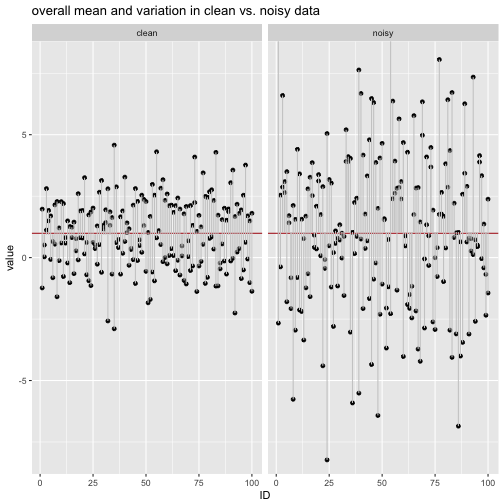
We see that the the variation (the grey deviation bars) are larger in the noisy data compared to the clean data.
Now let’s compute the average length (MAD) and the variance of the grey bars.
df_long_noise_level %>%
  group_by(noise_level) %>%
  summarise(value_mad = mean(abs(value - mean(.$value))),
            value_var = mean(((value - mean(.$value))^2)))
## # A tibble: 2 × 3
##   noise_level value_mad value_var
##         <chr>     <dbl>     <dbl>
## 1       clean  1.163611  1.963961
## 2       noisy  2.473277  9.985220
Explaining variable
Now let’s investigate the influence of some “explaining” variable. Say, our data stems from two populations, the experimental condition and the control condtion, with differing means. Assume that the experimental condition has a mean 2 sd higher than in the control condition. Hence, the grouping variable will help to reduce the variation.
First, we compute the summary statistics and join them to the main dataframe.
df_sum_group <-
  df_sum %>%
  select(-noise_level) %>%
  group_by(group) %>%
  summarise_all(funs(mean))

knitr::kable(df_sum_group)
| group | value_mean |
|---|---|
| cntrl | 0.0158219 |
| exp | 1.9628015 |
df_long_group <- df_long %>%
  left_join(df_sum_group, by = "group")
Now, plot the data conditioned on the explaining variable, ie., the condition (experimental vs. control).
df_long_group %>%
  ggplot +
  aes(x = ID, y = value) +
  facet_wrap(~group) +
  geom_point() +
  geom_hline(data = df_sum_group, aes(yintercept = value_mean), color = "firebrick") +
  geom_linerange(aes(ymin = value_mean, ymax = value), color = "grey80") +
  labs(title = "overall mean and variation in the experimental vs. control group data") +
  coord_cartesian(ylim = c(-8,8))
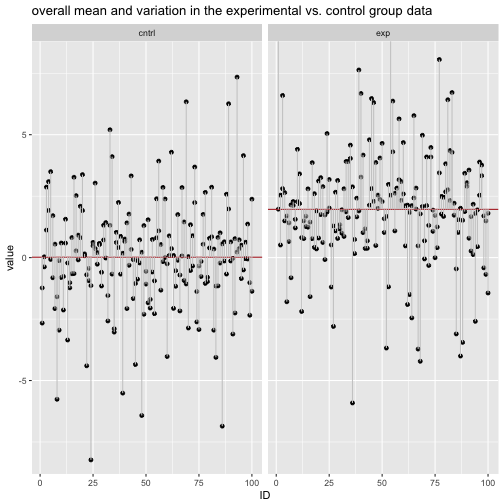
Practically speaking, if we measure the deviation to the respective group mean, we see that the deviation (aka, variation within each group) has decreased when considering the explaining variable.
In number parlance:
df_long_group %>%
  group_by(group) %>%
  summarise(value_mad = mean(abs(value - mean(.$value))),
            value_var = mean(((value - mean(.$value))^2)))
## # A tibble: 2 × 3
##   group value_mad value_var
##   <chr>     <dbl>     <dbl>
## 1 cntrl  1.777131  5.626771
## 2   exp  1.859757  6.322410
Whole picture
Now let’s compare all the four subgroups:
- clean vs. noisy data and
- data from experimental group vs. control group.
Again, we start by adding the group summaries to the main data frame for easier plotting.
df_long_all <- df_long %>%
  left_join(df_sum, by = c("group", "noise_level"))
And now we plot the 4 subgroups.
df_long_all %>%
  ggplot +
  aes(x = ID, y = value) +
  facet_wrap(noise_level~group) +
  geom_point() +
  geom_hline(data = df_sum, aes(yintercept = value_mean), color = "firebrick") +
  geom_linerange(aes(ymin = value_mean, ymax = value), color = "grey80") +
  labs(title = "overall mean and variation ") +
  coord_cartesian(ylim = c(-8,8))
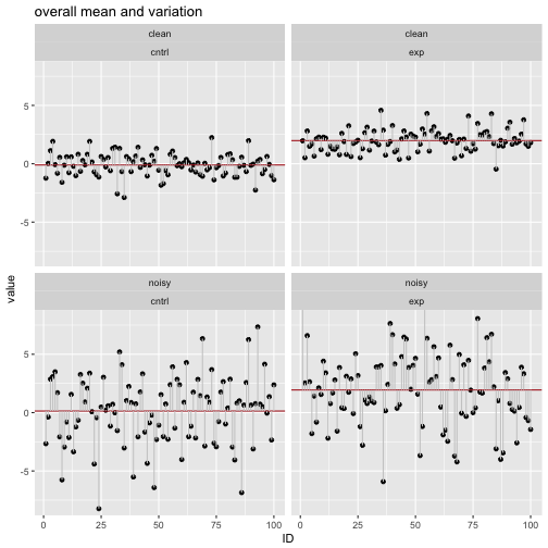
Similarly to the previous steps, we calculate the summary statistics for each of the 4 groups.
df_long_all %>%
  group_by(noise_level, group) %>%
  summarise(value_mad = mean(abs(value - mean(.$value))),
            value_var = mean(((value - mean(.$value))^2)))
## Source: local data frame [4 x 4]
## Groups: noise_level [?]
##
##   noise_level group value_mad value_var
##         <chr> <chr>     <dbl>     <dbl>
## 1       clean cntrl  1.215744  2.090082
## 2       clean   exp  1.111477  1.837840
## 3       noisy cntrl  2.338518  9.163459
## 4       noisy   exp  2.608036 10.806981
Conclusion
Two conclusions can be drawn. First, any explaining variable will reduce the variation within the group (at least it will not increase the within group variation). This effect is what is called “the variable explains the target variable”. To the degree the deviation bars decrease in size (on overage), one can say that “explanation” occurred.
Second, any noise variable will increase the variation within the groups. This effect could be called “the variable blurs the target variable”.