Let’s plot some skewed stuff, aehm, distributions!
Actually, the point I - initially - wanted to make is that in skewed distribution, don’t use means. Or at least, be very aware that (arithmetic) means can be grossly misleading. But for today, let’s focus on drawing skewed distributions.
Some packages:
library(tidyverse)
library(fGarch) # for snorm
Some skewed distribution include:
- “polluted” normal distributions, ie., mixtures of two normals
- Exponential distributions
- Gamma distributions
- Beta distributions
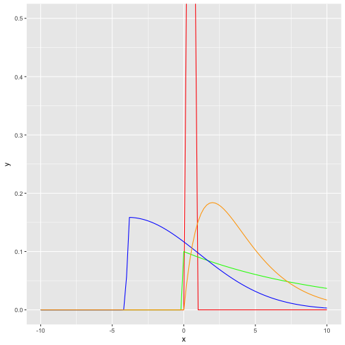
One way to visualize them is to draw their curve, ie., their functional (analytical) form:
data_frame(
  x = seq(-10, 10, .05)
) %>%
  ggplot +
  aes(x) +
  stat_function(fun = dbeta, args = list(shape1 = 4, shape2 = 4), color = "red") +
  stat_function(fun = dexp, args = list(rate = .10), color = "green") +
  stat_function(fun = dsnorm, args = list(mean = 0, sd = 3, xi = 7.5), color = "blue") +
  stat_function(fun = dgamma, args = list(shape = 2, scale = 2), color = "orange") +
  coord_cartesian(ylim = c(0,.5))

Second, we could draw some random instances from the respective distribution; we will get then not “smooth” curves but more “realistic” or “zigzag” histogram (or density diagrams).
df <- data_frame(
  skewed_normal = rsnorm(n = 1000, mean = 0, sd = 18, xi = 130),
  exp_distrib = rexp(n = 1000, rate = .1),
  gamma_distrib = rgamma(n = 1000, shape = 2, scale = 2),
  beta_distrib = rbeta(n = 1000, shape1 = 4, shape2 = 2)

)
mypal <-

df %>%
  gather(key = distribution, value = value) %>%
  ggplot +
  aes(x = value) +
  geom_histogram(aes(fill = distribution)) +
  facet_wrap(~distribution) +
  scale_fill_manual(values = c("red", "green", "blue", "orange")) +
  scale_color_manual(values = c("red", "green", "blue", "orange")) +
  labs(title = "Histogram of random draws from different distributions",
       subtitle = "test")
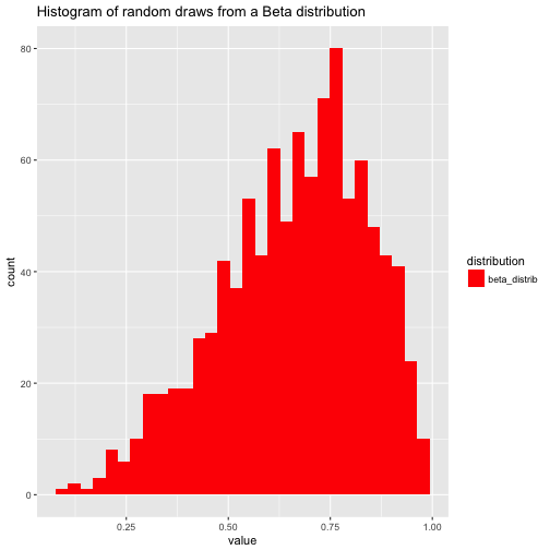
Note that the domain of the beta distribution is [0,1], that’s why a narrow red bar pops out as histogram (the other distribution spread out much more explicitly). See:
df %>%
  gather(key = distribution, value = value) %>%
  dplyr::filter(distribution == "beta_distrib") %>%
  ggplot +
  aes(x = value) +
  geom_histogram(aes(fill = distribution)) +
  #facet_wrap(~distribution) +
  scale_fill_manual(values = c("red", "green", "blue", "orange")) +
  scale_color_manual(values = c("red", "green", "blue", "orange")) +
  labs(title = "Histogram of random draws from a Beta distribution")
## `stat_bin()` using `bins = 30`. Pick better value with `binwidth`.
