Moderator effects or interaction effect are a frequent topic of scientific endeavor. Put bluntly, such effects respond to the question whether the input variable X (predictor or independent variable IV) has an effect on the output variable (dependent variable DV) Y: “it depends”. More precisely, it depends on a second variable, M (Moderator).
More formally, a moderation effect can be summarized as follows:
If the effect of X on Y depends on M, a moderator effect takes place.
There exist some typical procedures to detect such effects. In this post, however we are concerned only with the visualization of moderation.
To do so, we will distinguish three situations: Where X and M are nominal, where X and M are numeric, and situations where one of them is nominal and the other numeric.
We will look at some visualization methods based on ggplot2 (don’t forget to install upfront if not yet installed). We will use the dataset tips from reshape2. dplyr will be used for data mingling.
library(ggplot2)
library(dplyr)
tips <- read.csv("https://sebastiansauer.github.io/data/tips.csv")
IV: numeric, M: nominal
Let’s assume we take total_bill as predictor (X), and sex as moderator; tip is the criterion (outcome).
qplot(x = total_bill, y = tip, facets = ~sex, data = tips) +
  geom_smooth(method = "lm")
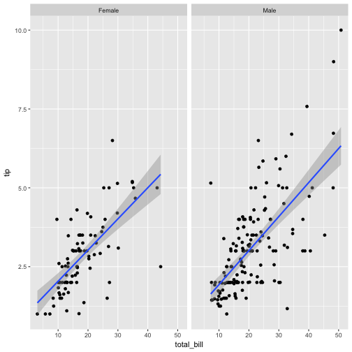
The data set is split in two facets; a regression line indicates the strength of association in each level of the moderator.
However, as the two lines are not aligned, they are of limited use for visual comparison. Better place the lines in one, single diagram.
qplot(x = total_bill, y = tip, data = tips, color = sex) +
  geom_smooth(method = "lm")
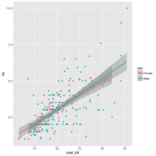
Now we see clearly that there are little differences between the groups, if at all.
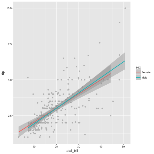
Some tweaks:
ggplot(tips) +
  aes(x = total_bill, y = tip, color = sex) +
  geom_point(color = "grey") +
  geom_smooth(method = "lm")
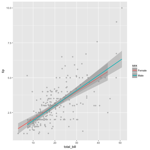
Or:
tips_f <- filter(tips, sex == "Female")
tips_m <- filter(tips, sex == "Male")


ggplot(tips) +
  aes(x = total_bill, y = tip, color = sex) +
  geom_point(color = "grey") +
  geom_smooth(method = "lm", data = tips_f) +
   geom_smooth(method = "lm", data = tips_m)
IV: nominal, M: nominal
ggplot(tips) +
  aes(x = sex, y = tip) +
  geom_boxplot() +
  facet_wrap(~smoker)
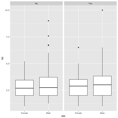
The moderator effect can be put in this question here “Is the difference between the sexes of equal size in non-smokers the same as in smokers”? It appears that there is little difference in the differences, hence little indication for a moderator effect.
We can also do the statistical summary ourselves:
tips %>%
  group_by(sex, smoker) %>%
  summarise(tip_groups = mean(tip)) -> tips2


tips2 %>%
  ggplot() +
  aes(x = sex, y = tip_groups, color = smoker) +
  geom_line(aes(group = smoker)) +
  geom_point()
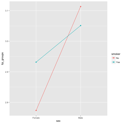
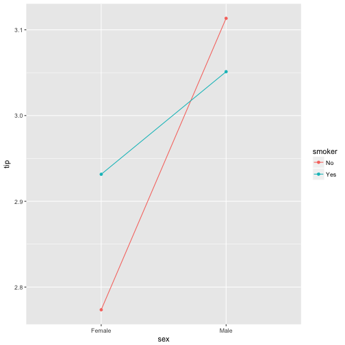
This plot argues for some interaction of the two predictors, as the lines are not parallel (in fact they are crossed here).
Similarly, in ggplot2:
tips %>%
  ggplot() +
  aes(x = sex, color = smoker, group = smoker, y = tip) +
  stat_summary(fun.y = mean, geom = "point") +
  stat_summary(fun.y = mean, geom = "line")
IV: metric, M: metric
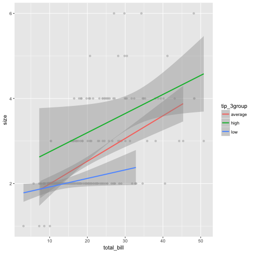
As the effect of the metric moderator is not straight-forward to plot, it is convenient to discretize the metric moderator. For example, in two groups (median split) or in three (1 sd below the mean, mean, 1 sd above the mean, or in terciles…). Then we proceed as above.
tips$tip_2tile <- ntile(tips$tip, 2)
head(tips$tip_2tile)
## [1] 1 1 2 2 2 2
tips$tip_3tile <- ntile(tips$tip, 3)
head(tips$tip_3tile)
## [1] 1 1 3 3 3 3
x <- tips$tip

tips$tip_3group <-
  case_when(x > mean(x)+sd(x) ~ "high",
            x < mean(x)+sd(x) & x > mean(x)-sd(x) ~ "average",
            x < mean(x)-sd(x) ~ "low")

count(tips, tip_3group)
## # A tibble: 3 × 2
##   tip_3group     n
##        <chr> <int>
## 1    average   182
## 2       high    32
## 3        low    30
tips %>%
  ggplot() +
  aes(x = total_bill, y = size, group = tip_3group, color = tip_3group) +
  geom_point(color = "grey", alpha = .7) +
    geom_smooth(method = "lm")
Debrief
In sum, ggplot2 provides some handy functions for visualizing moderator effects. In addition to traditional regression analyses, such plots can help to better grasp what actually is going on.